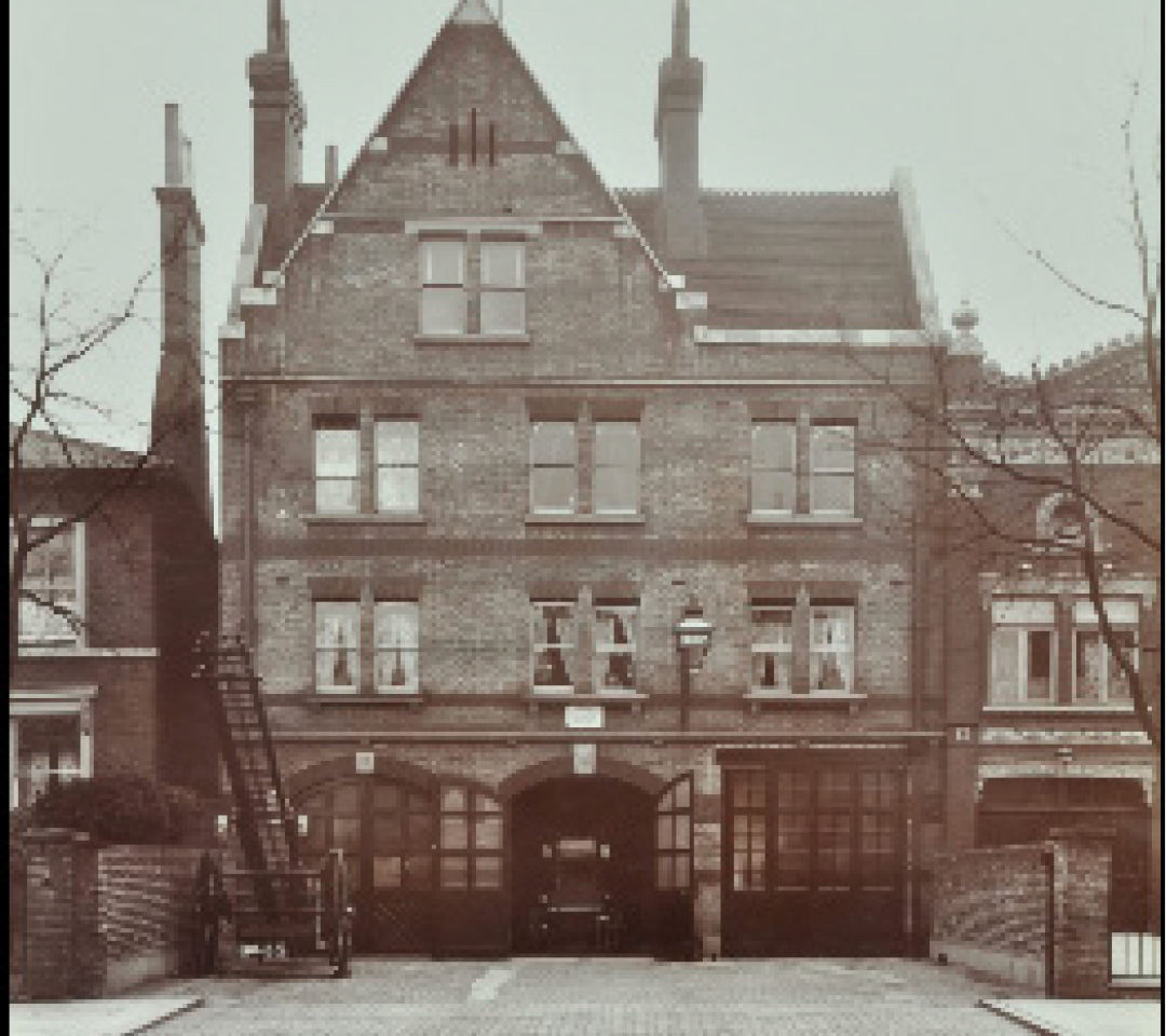
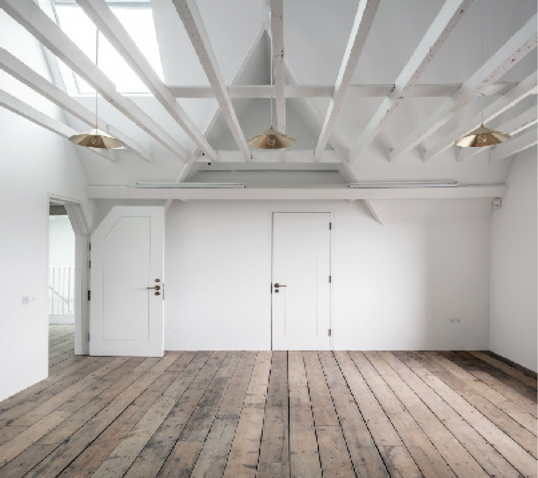
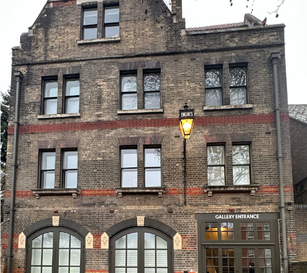
For my font I took inspiration from my chosen site, which was the South London Art Gallery Firestation. In my research I took interest in the idea of the physical gallery having a sense of imbalance of the building. As it is a grade 2 listed buildings which in this case meant that the exterior of the building had to remain the same.The outside of the building feels old and vintage, whereas the interior feels modern and clean.I also liked the purpose of the building as an art gallery, so I wanted my font to have a handwritten effect.