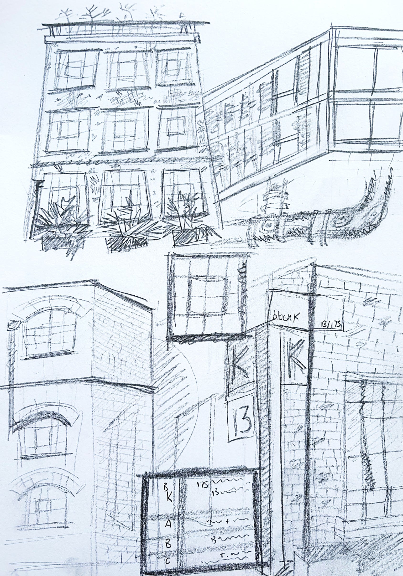
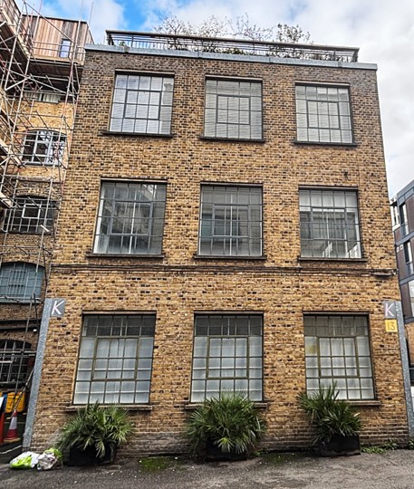
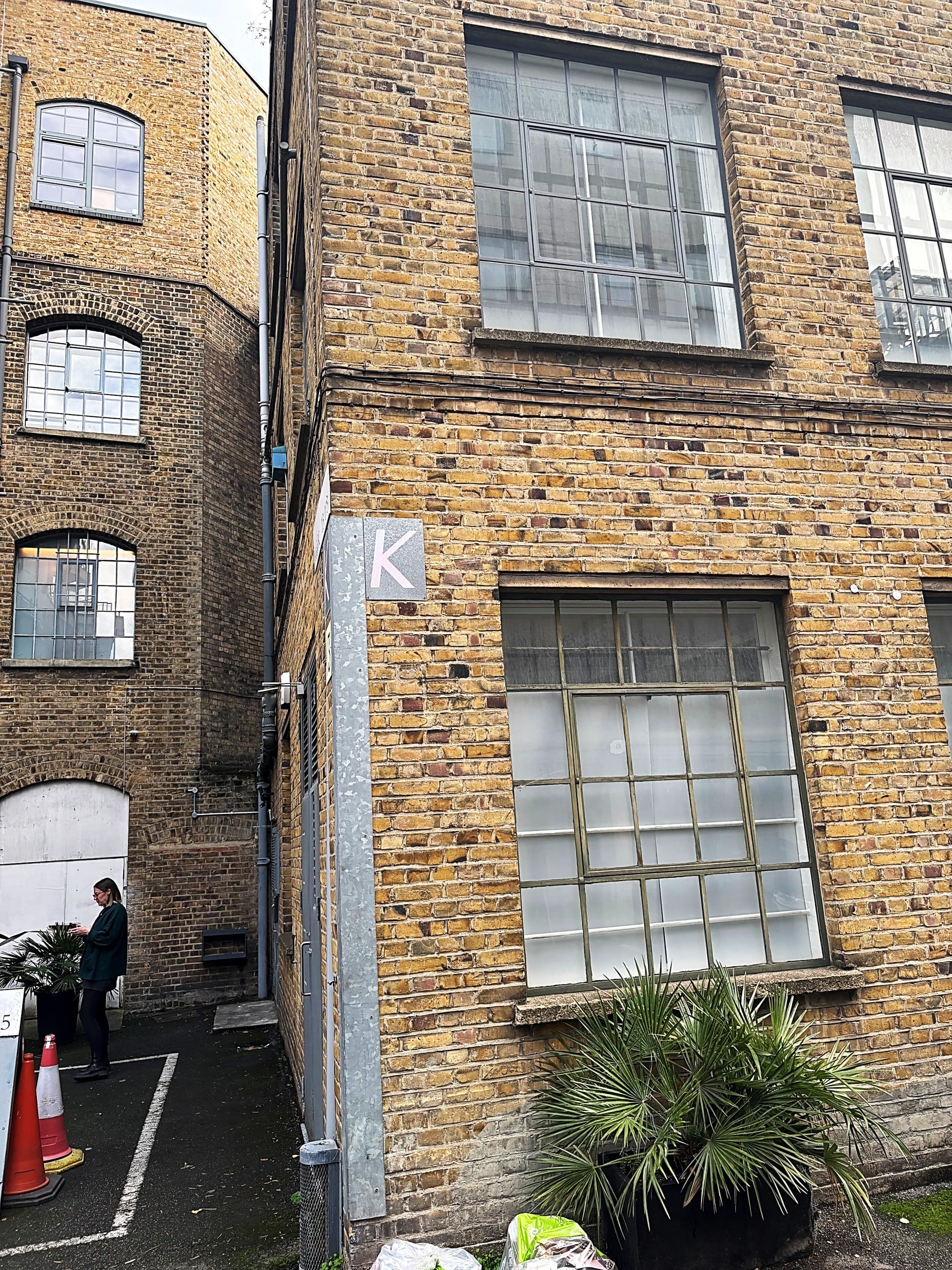
Looking closely at the formal elements of my site, Tikari Works, I settled on the windows which I noticed have interesting frameworks throughout. I made the decision to introduce these elements as grids within the skeleton for each letterform. These could be deconstructed and then built up again as I worked with them. The result is a structural, sculptural-looking typeface featuring lines and blocky shapes. The font itself also has added perspective such that you are always looking up at it to emphasize the characteristic of looking through a window.