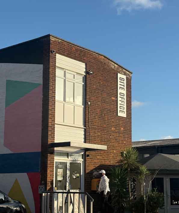
This typeface uses bold weight and simple shapes to make the letters clear and easy to read. The clean forms help each character stand out, especially when used at a large scale on a building. Rounded shapes soften the heavy strokes, giving the type a modern feeling. By removing small details, the letters stay clear from a distance and are easy to recognize at a glance. The consistent shapes across the alphabet create a strong and unified look. This makes the typeface practical, readable, and well suited for use in the Bussey Building.