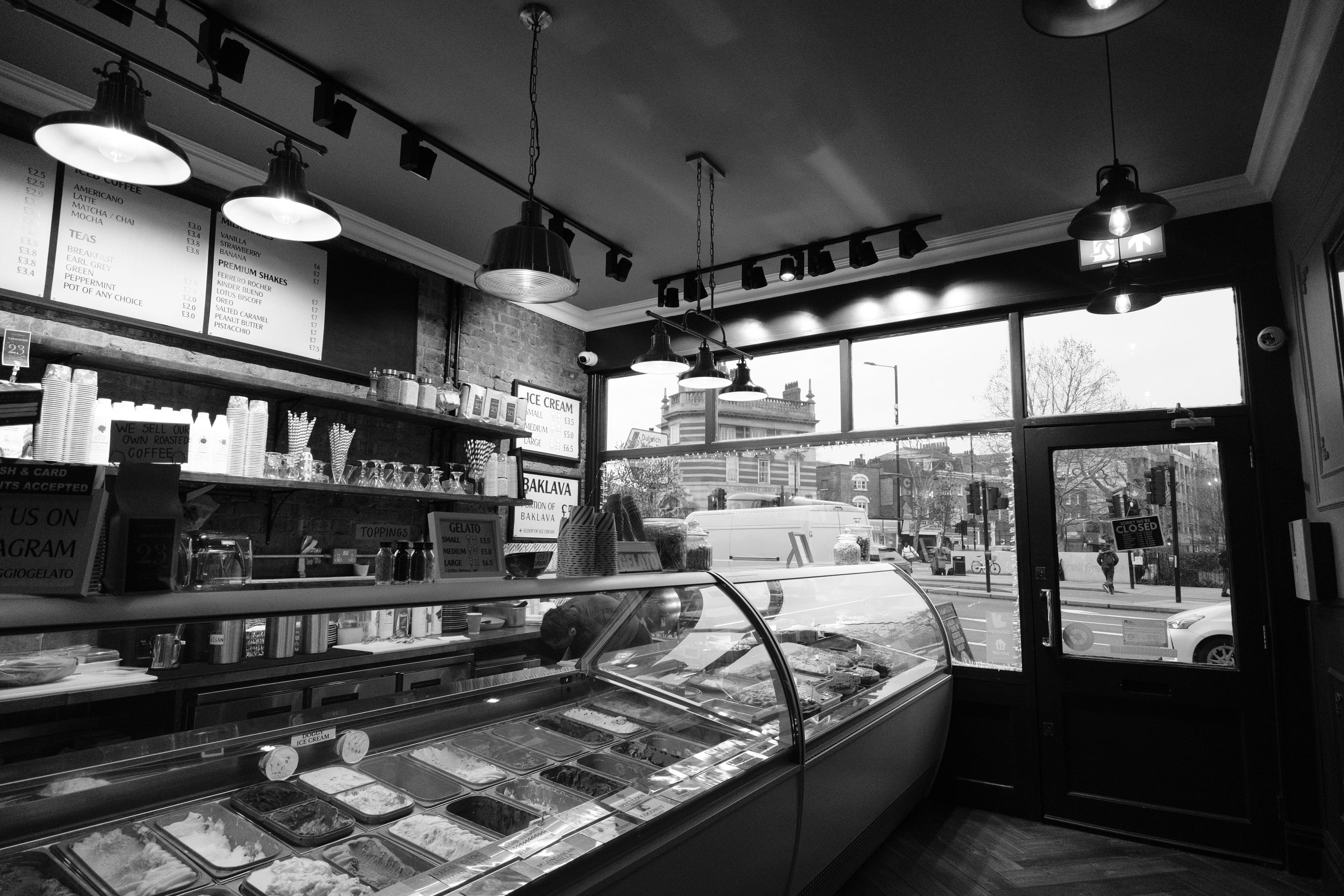
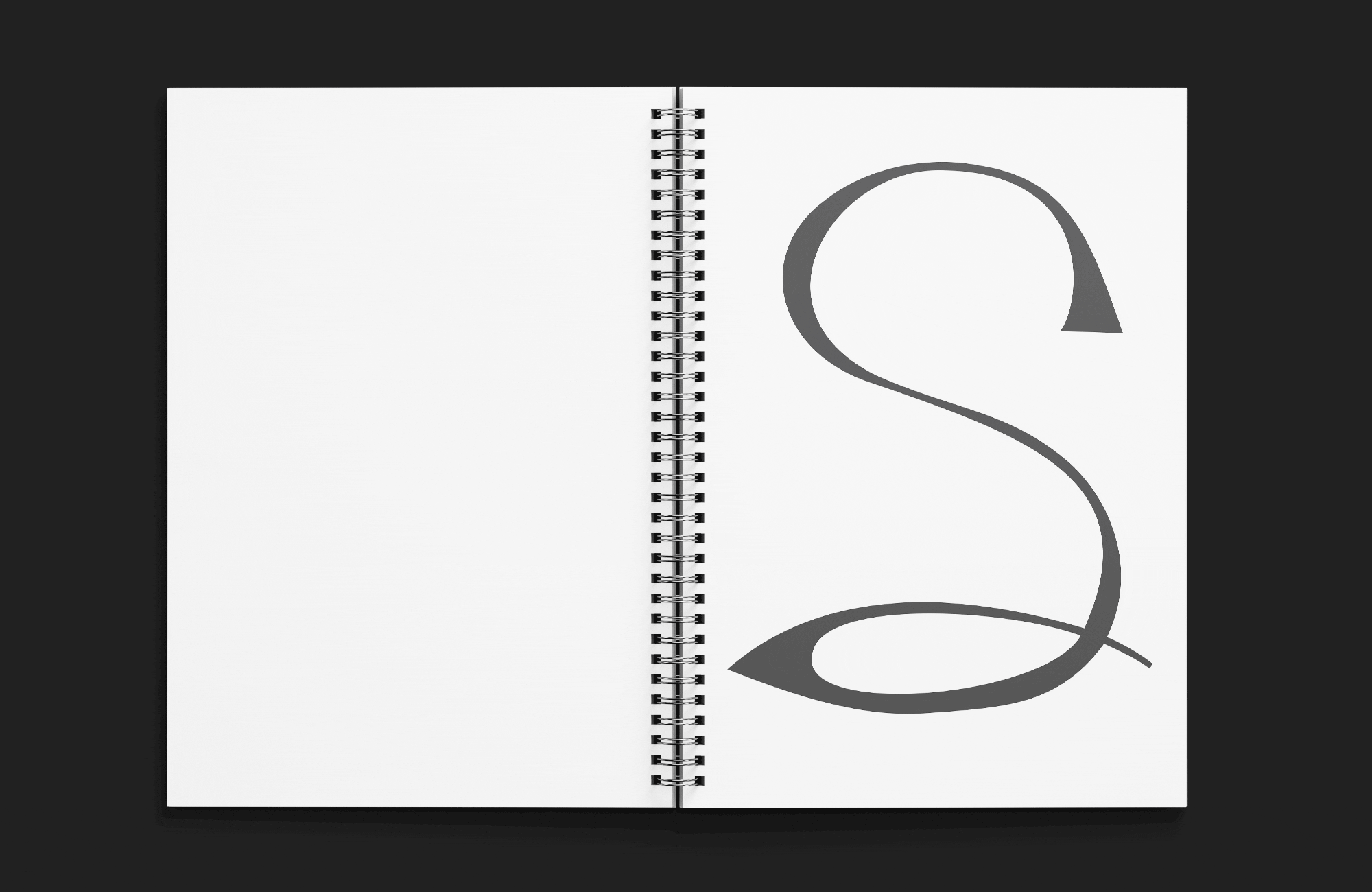
'Sever' is a calligraphic typeface inspired by my chosen site Caravaggio, a dessert bar in Camberwell. It shares a name with the Italian baroque artist whose violent history with sword fighting informs the aggressive, slashed letterforms. The typeface explores fast, natural movement through stroke order, cursive connections and varied line weight. Thin lines suggest swift motion, whilst heavier strokes mark slower changes in direction. Sever creates a hybrid of upper and lowercase forms to evoke the unpredictability of combat, and features three variations of 'severedness' reflecting Caravaggio's three main battles: his first murder (Swing), brawls in exile (Split) and the assault that led to the disfigurement of his face (Sever).