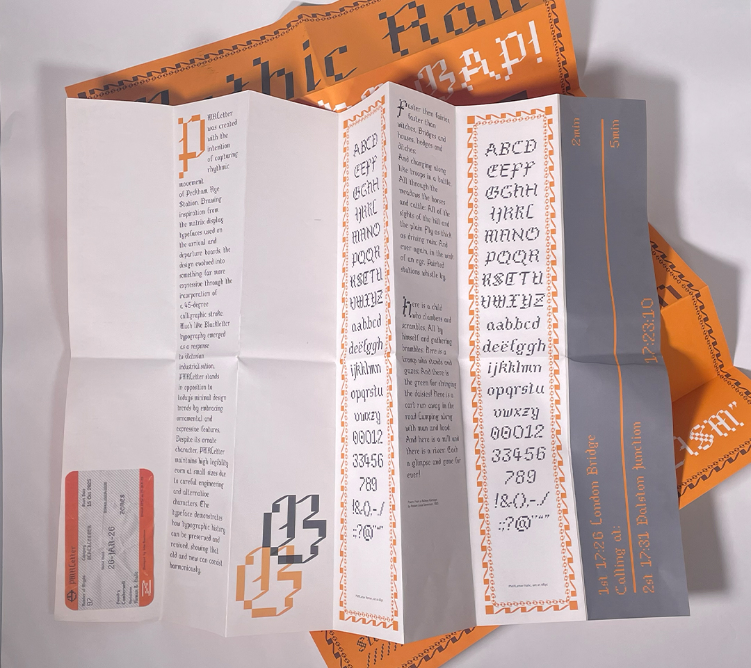
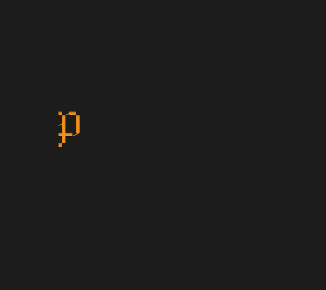
PMRLetter was created with the intention of capturing rhythmic movement of Peckham Rye Station. Drawing inspiration from the matrix display typefaces used on the arrival and departure boards, the design evolved into something far more expressive through the incorporation of a 45-degree calligraphic stroke. Much like Blackletter typography emerged as a response to Victorian industrialisation, PMRLetter stands in opposition to today's minimal design trends by embracing ornamental and expressive features. Despite its ornate character, PMRLetter maintains high legibility even at small sizes due to careful engineering and alternative characters. The typeface demonstrates how typographic history can be preserved and revived, showing that old and new can coexist harmoniously.