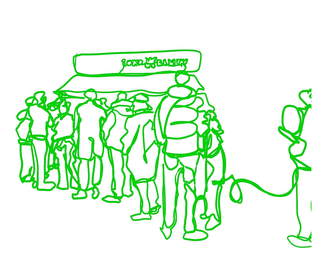
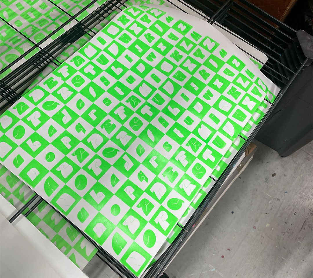
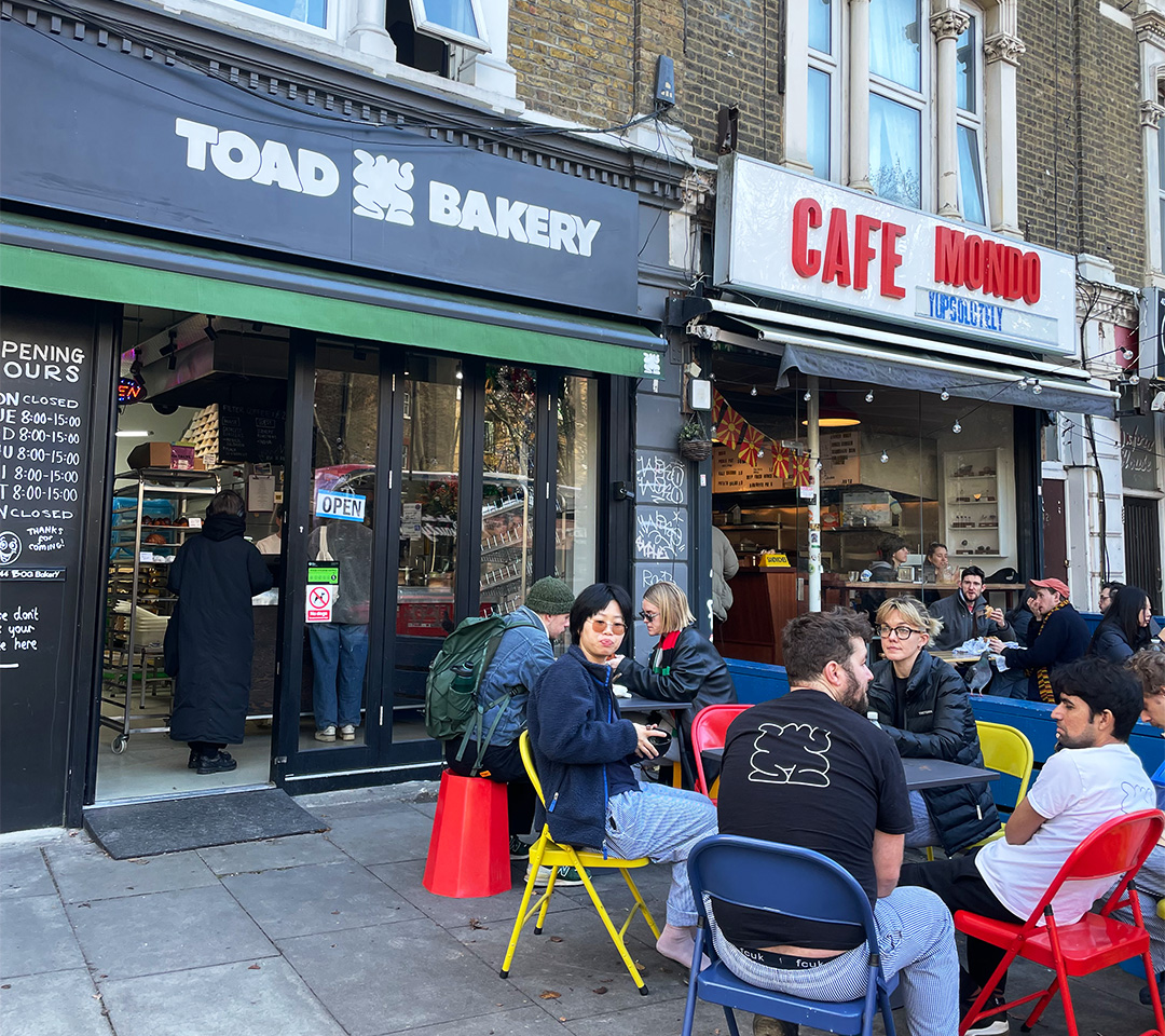
Knead type design was inspired by Toad Bakery, in particular, the commensality that people and food bring to a site. It mirrors the spatial practice that resides outside, as well as the small yet precise details that are found in their baked goods. The type face intentionally takes up space, with a wide width, small counters and a slight slant. Its small complex structures render its legibility. Made for the community, Knead is an independent typeface, perfect for communicating concise yet strong community slogans, small business names and creative display posters.