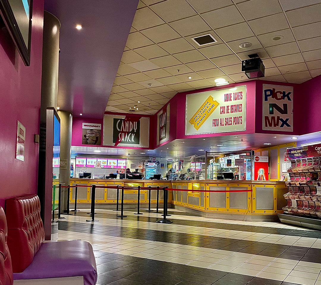
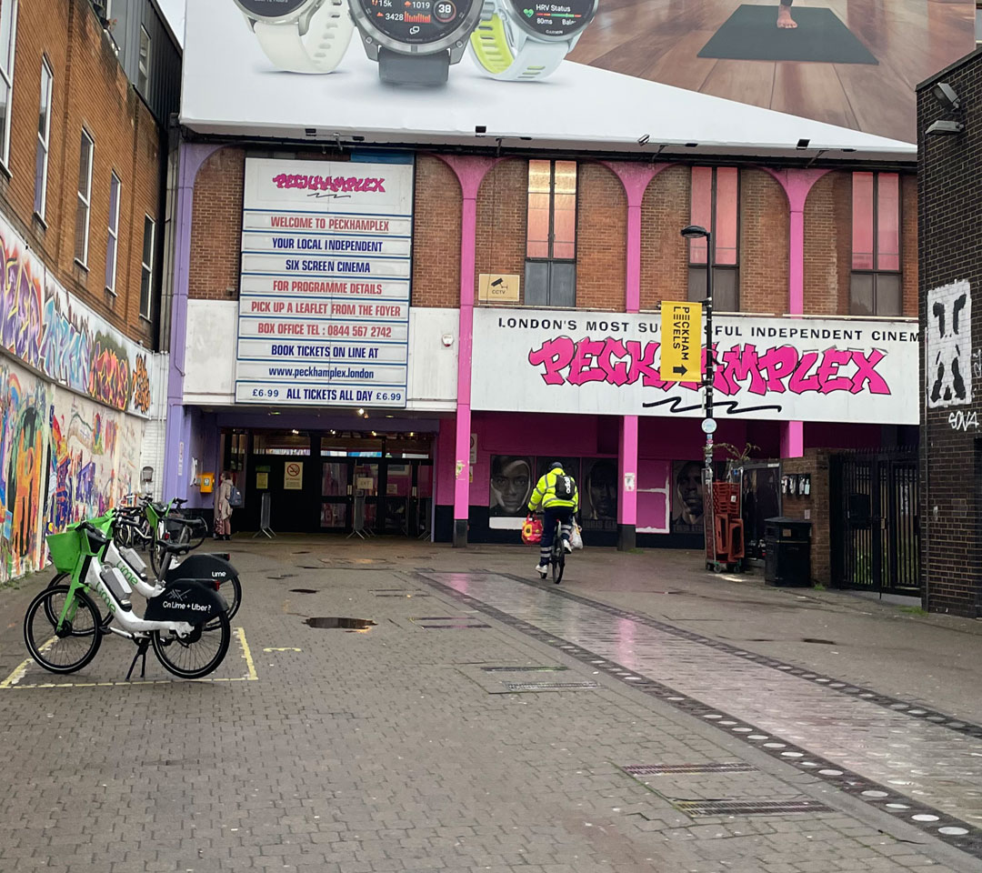
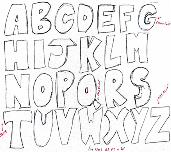
Kiosk was inspired by the bubbly 90s-inspired atmosphere of the PeckhamPlex. With unique furniture, smells, sounds, and a sense of community, I felt the PeckhamPlex was a place of warmth, even if it was slightly rough around the edges. The use of stars in this typeface was a particularly important addition, reflecting the building's unique character and star quality. Through rounded edges, thick lettering, and the repeated use of the star motif, Kiosk captures the retro essence of the building whilst also conveying the liveliness, character, and wholesomeness that come with an experience at the PeckhamPlex.