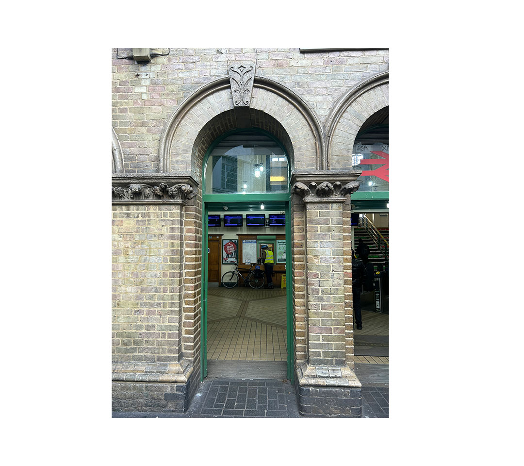
I was inspired to create this font after visiting Peckham Rye station, where I noticed the mix of old architecture and modern technology. What stood out to me most were the display boards and how clear and readable they were, even from metres away. I liked how they balanced function with character, and I wanted my font to do the same. I focused on making the letterforms bold, clear and easy to read from a distance, while still feeling interesting and modern. The aim was to design a font that feels practical, approachable and suitable for everyday use.