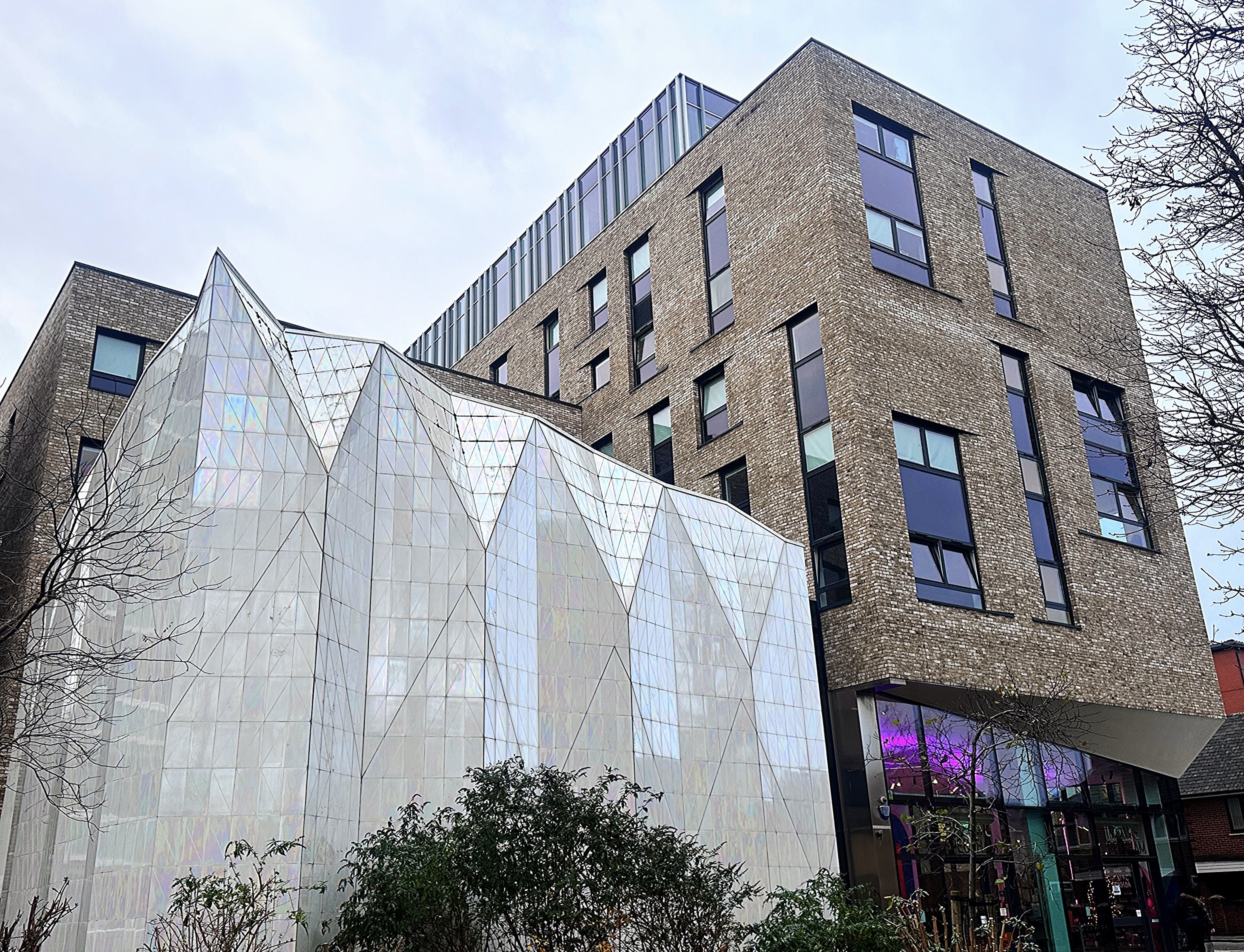
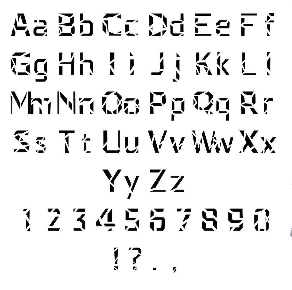
Cue Line is typeface that draws inspiration from the contrast between real life and theatrical performance, mirroring this duality in the architecture of Theatre Peckham. The typeface was created as a sculptural response to the Theatre's architecture. The letterforms were built from sharp, geometric fragments inspired by the building's crystal-like structure, translating its exterior into type. Each letter was formed from simple shapes that came together to create angular forms, echoing the physical presence of the building itself. The fragmented construction referenced theatrical space, where elements are assembled to create meaning. By focusing on geometry, simplicity, and sculptural form, the typeface reflected Theatre Peckham as both an architectural landmark and a place of performance.