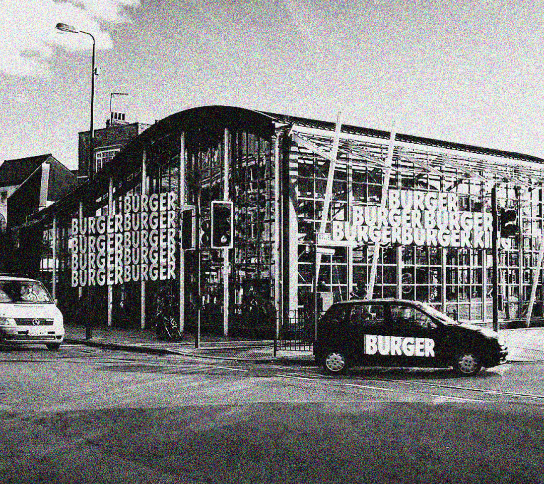
The font Brick by Brick is influenced by the site Burger King. They are amongst companies that dilute Culture making everything looking the same and soulless, my typeface goes against the trend of this Minimalism and prioritises Sporadic ideas and the beauty in uniqueness. The font Challenges Burger King and their effects on the area Including secondary and Primary effects Within the Community of Peckham, from Low pay and the lack of information from where the food is sourced, I encapsulate this feeling through shape and placement. The capitals and lowercase letters represent Pre-gentrification Versus post, the Capitals being Post.