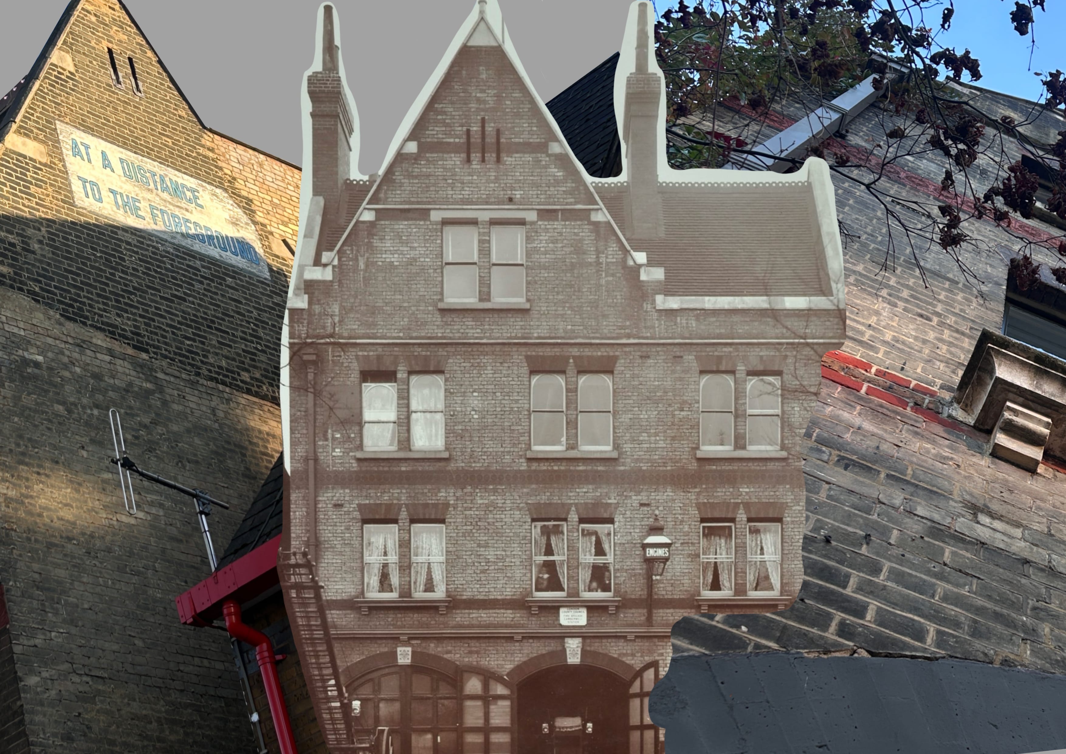
Wild is inspired by the Peckham Fire Station, blending the locations's energy with a playful,flamy and blocky aesthetic reminiscent of gaming fonts. While maintaining a fun appearance, the design still embodies the theme ?of fire. Each flames is unique, symbolising the unpredictable and uncontrollable nature of fire.
The uppercase and lowercase letters are intentionally designed to evoke different stages of a fire's impact. The lowercase letters, with their fluid, flame-like strokes, represent an active, consuming force'almost as if the fire is 'eating' into the ?letter, continuously burning and flowing. This gives a sense ?of movement and ongoing destruction. In contrast, the uppercase letters are more rigid and blocky, representing ?a moment of aftermath. The fire has ceased its spread, leaving behind a charred, static impression, as if the flames have exhausted themselves, leaving only a burnt residue.