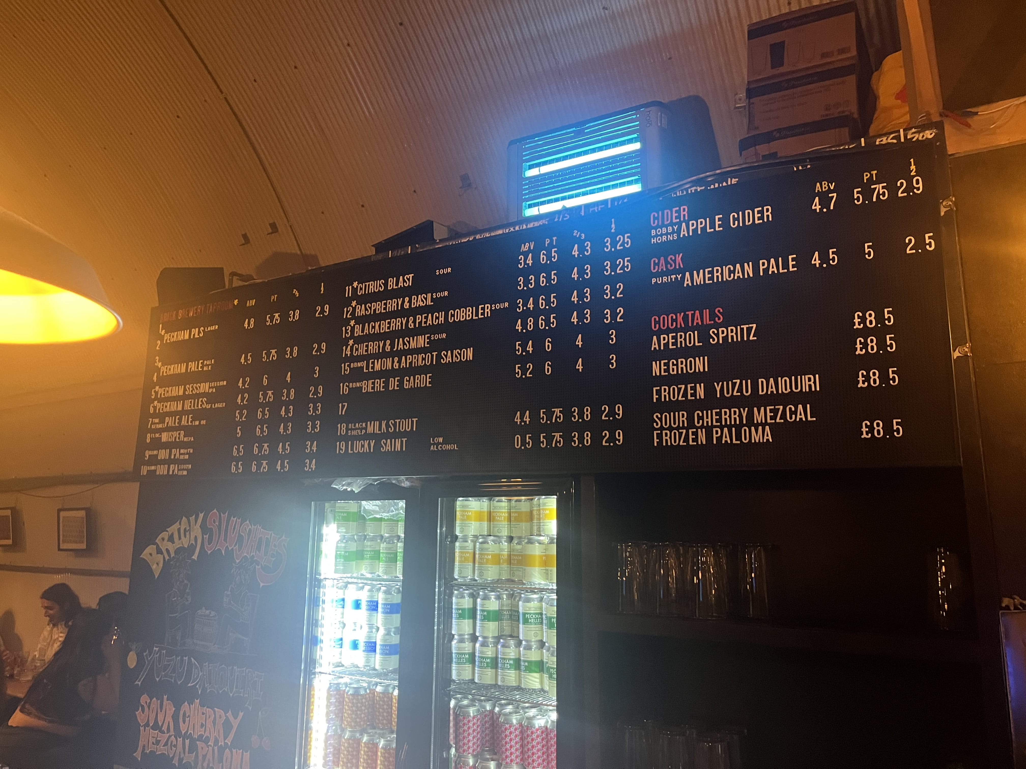
With the creation of this font, I was trying to reflect the fluid nature of the beers sold within the premises (due to the 20 taps the brewery has). However, the fluidity of the font also lends itself to the erratic and sociable environment that the brewery holds (especially at busier times like Friday and Saturday nights), and even the rugged design and construction of the location through aspects such as exposed wooden beams, and corrugated steel panels covering the arched roof.
Tap 20
By Harry Beauchamp
Harry Beauchamp
Character Set
A
B
C
D
E
F
G
H
I
J
K
L
M
N
O
P
Q
R
S
T
U
V
W
X
Y
Z
a
b
c
d
e
f
g
h
i
j
k
l
m
n
o
p
q
r
s
t
u
v
w
x
y
z
1
2
3
4
5
6
7
8
9
0
!
?
.
,
