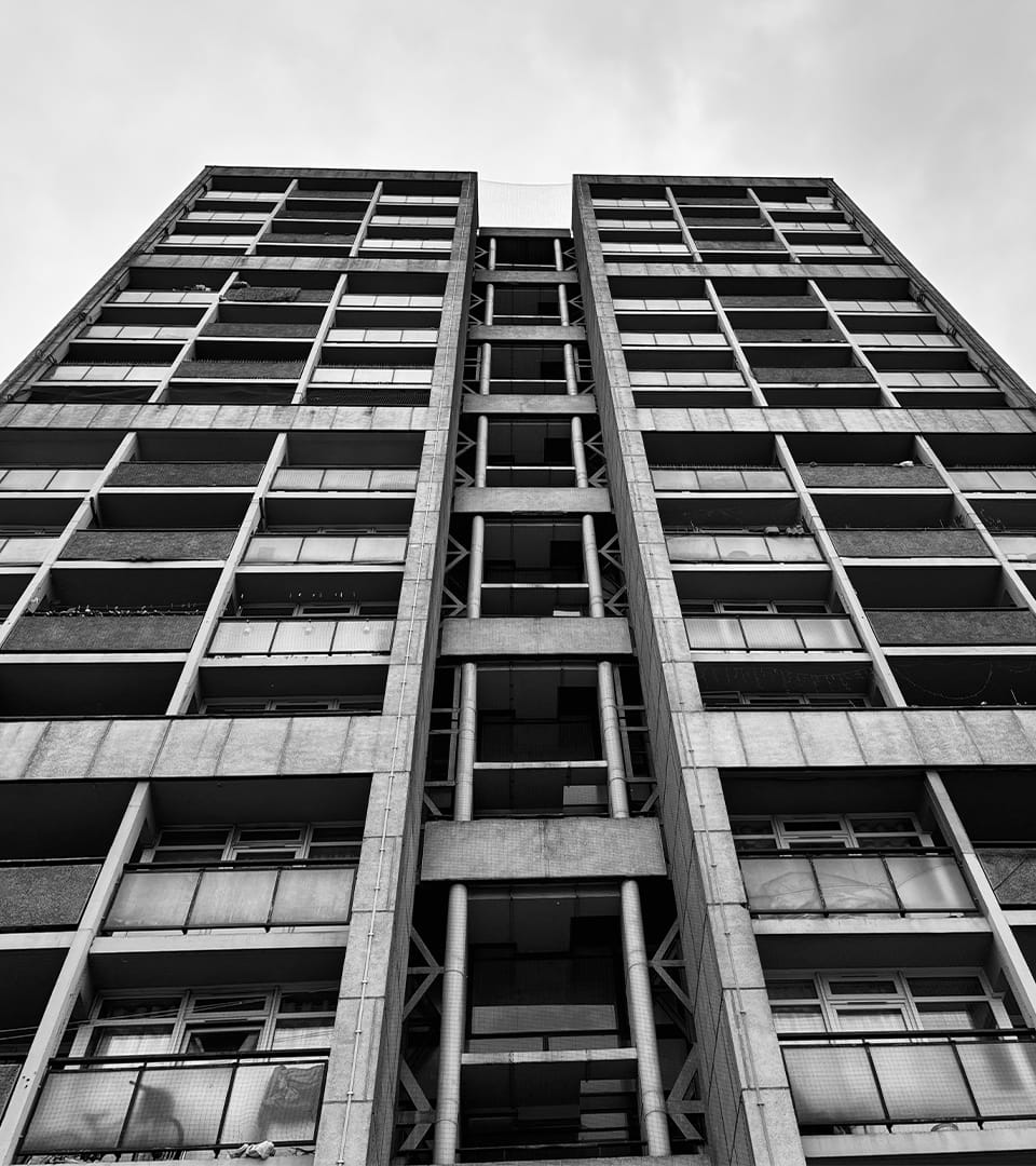
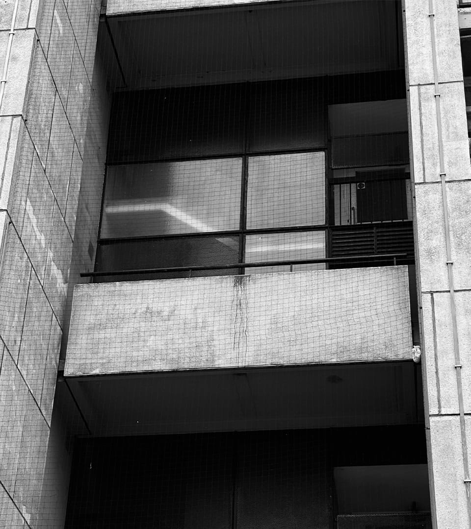
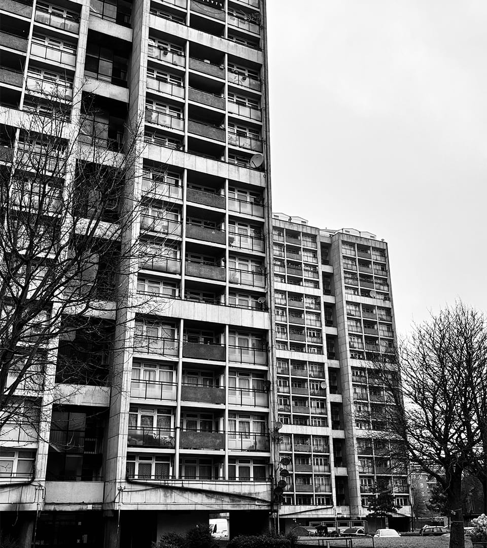
This experimental typeface is a geometric, grid-based system influenced by the structured design and concrete forms of the Brandon Estate. It reflects the architectural essence of the site, emphasizing balance, symmetry, and repetition. Each letterform is constructed using fine lines that mimic the estate's distinct window patterns and panel arrangements, embodying the raw, functional aesthetics of Brutalism. The interplay of positive and negative space creates a structured yet dynamic visual rhythm, reinforcing its mechanical and industrial character. Ideal for display use, this typeface is well-suited for contemporary, architectural, and technical applications, including posters, branding, and editorial design.