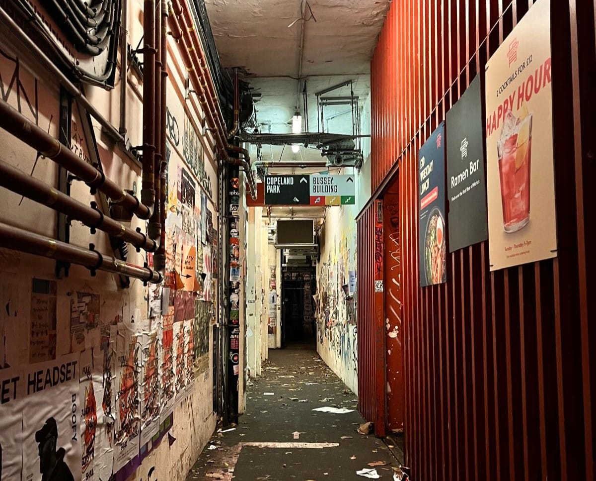
The 'Rivet' Typeface is an experimental display typeface inspired by the industrial elements and architectural nuances of the tunnel connecting Peckham Rye to Copeland Park and the Bussey Building. The design draws heavily from the jagged, uneven forms of the pipes lining the tunnel walls, imitating unapologetically bold aesthetic.
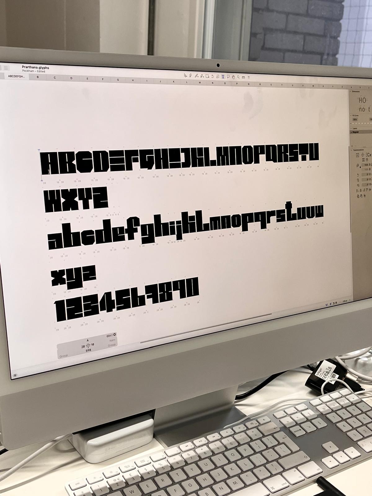
Rejecting traditional typeface conventions, each letter embodies structural complexity with sharp, irregular angles and bold strokes that mimic the fragmented yet parallel alignment of the pipes. The uppercase characters feature distinctive variations, including unique forms for letters like O, C, D, X, and M, which break free from the rigid blocky geometry seen in other glyphs.
I named my typeface Rivet as a reflection of its strong industrial roots and visual identity. A rivet, often used in construction to bind metal parts together, represents resilience, connection, and functionality.
This typeface avoids incorporating the graffiti and posters lining the walls of the tunnel, respecting the anonymity of their creators. Instead, it leans into elements that often go unnoticed'pipes that fade into the industrial background. By repurposing these overlooked structures, the typeface becomes a commentary on forgotten spaces, turning the mundane into a graphic and creative statement.