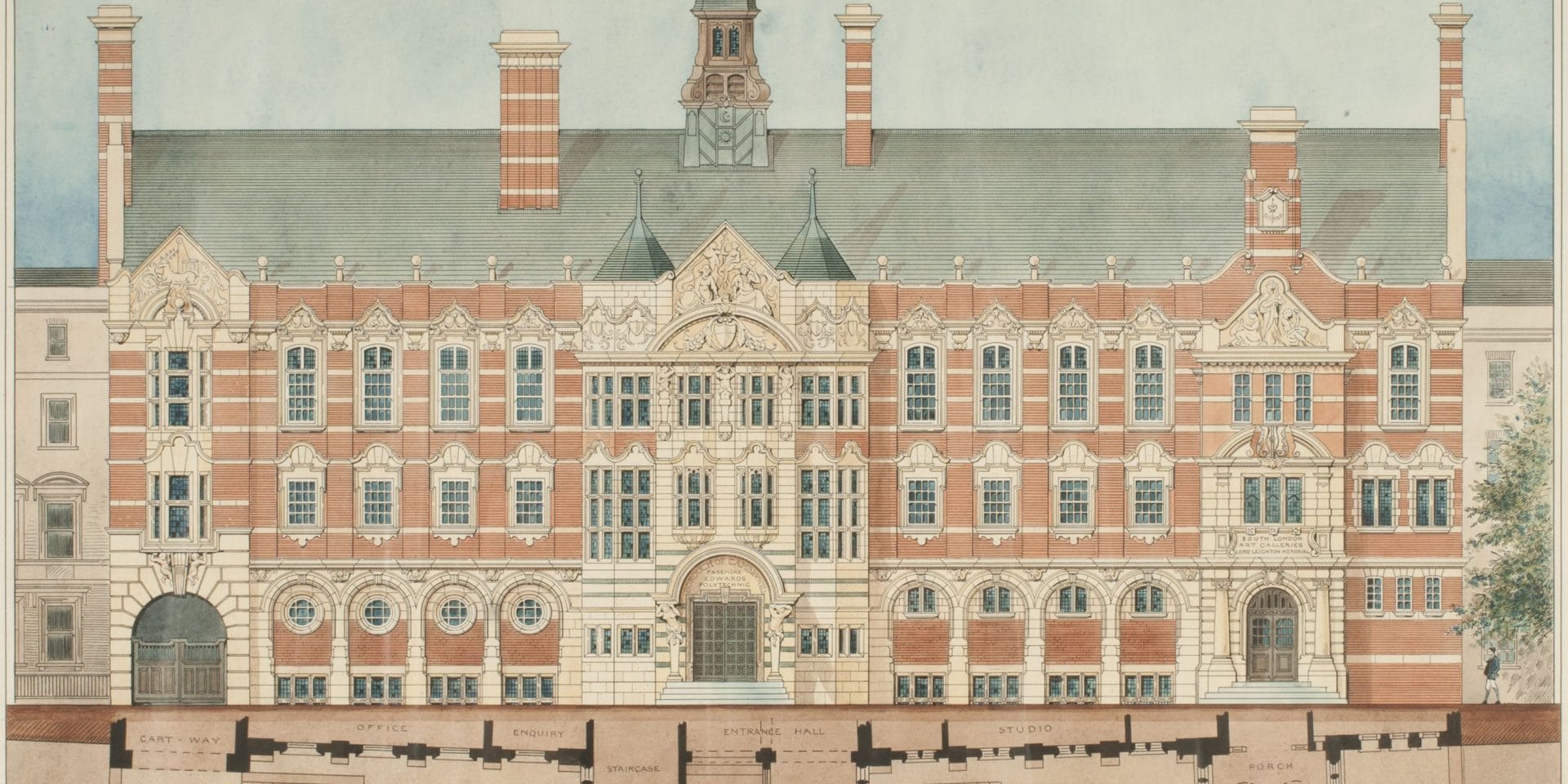
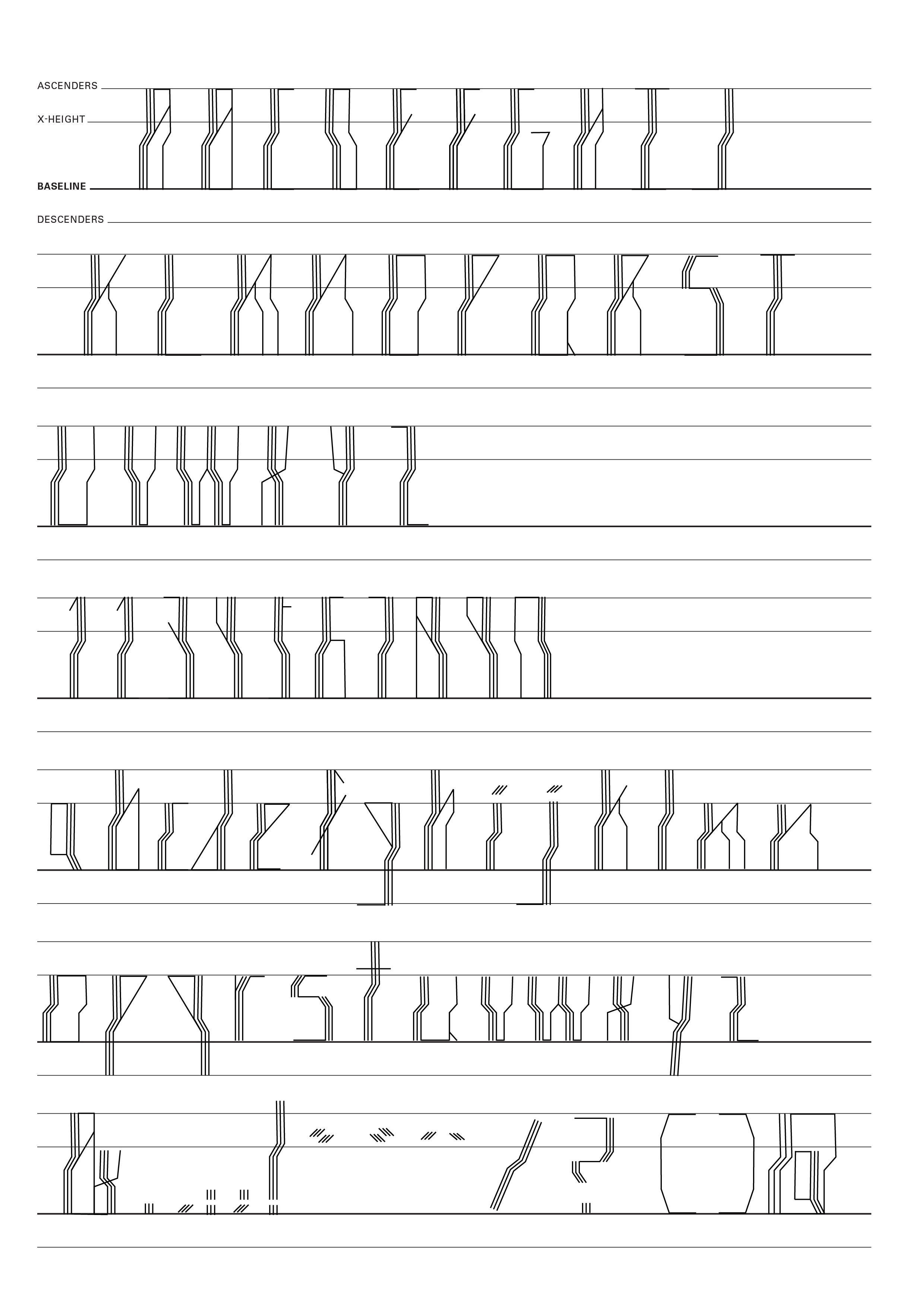
My font was inspired by the South London Gallery. The South London Gallery blends award-winning contemporary architecture with Victorian elegance with venues spanning, when I had my first visit, I w of the door as attracted by the various decorations and lines on the building. So, in my font design, I chose to use the lines of this building and integrate them with the alphabets to present a regular font without any curves. In my fonts, I always draw three vertical lines in parallel, which is the shape of the line took from the top edge in the gallery and then I follow these lines to form my letters, so the design of each letter looks coherent.

