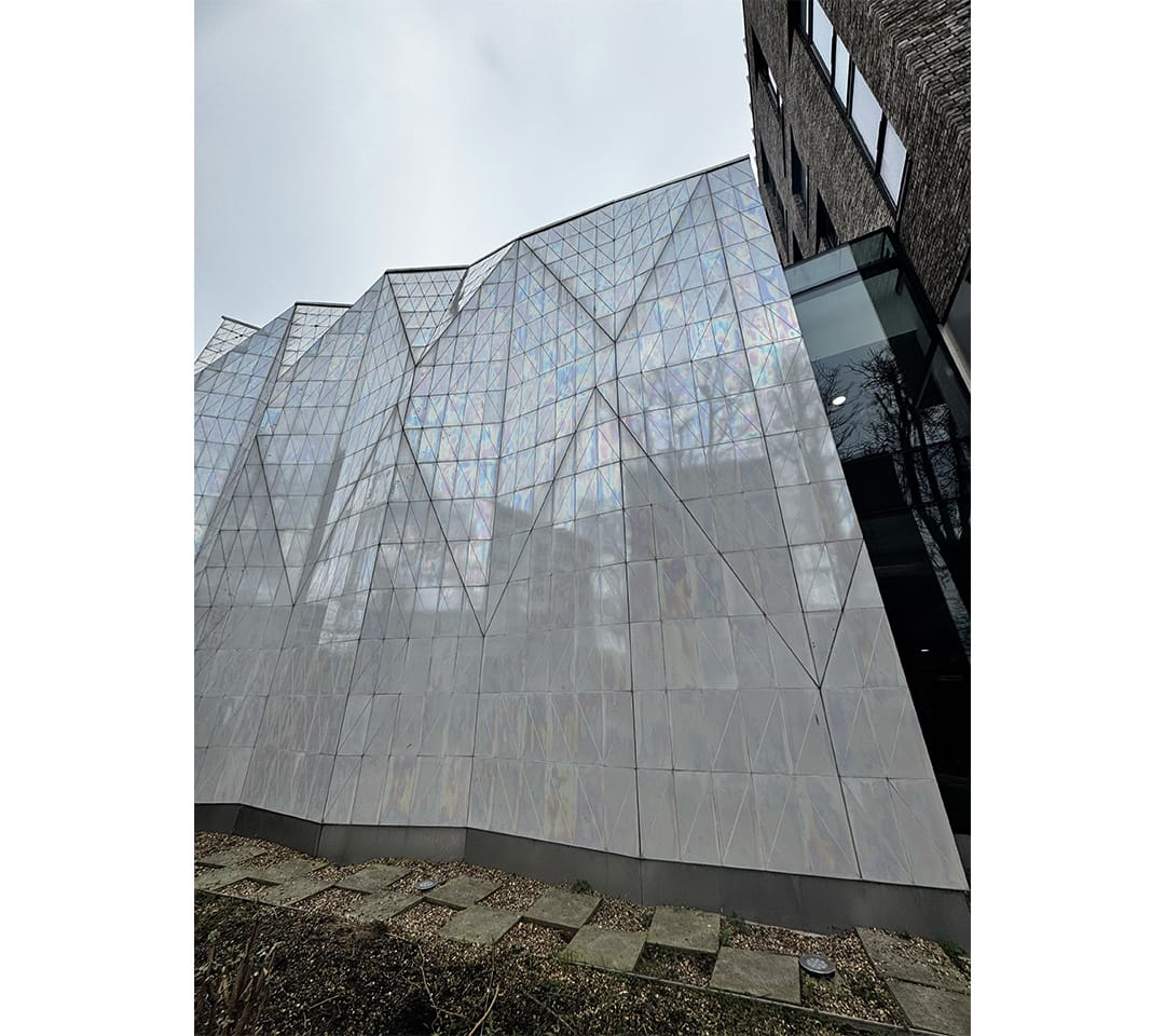
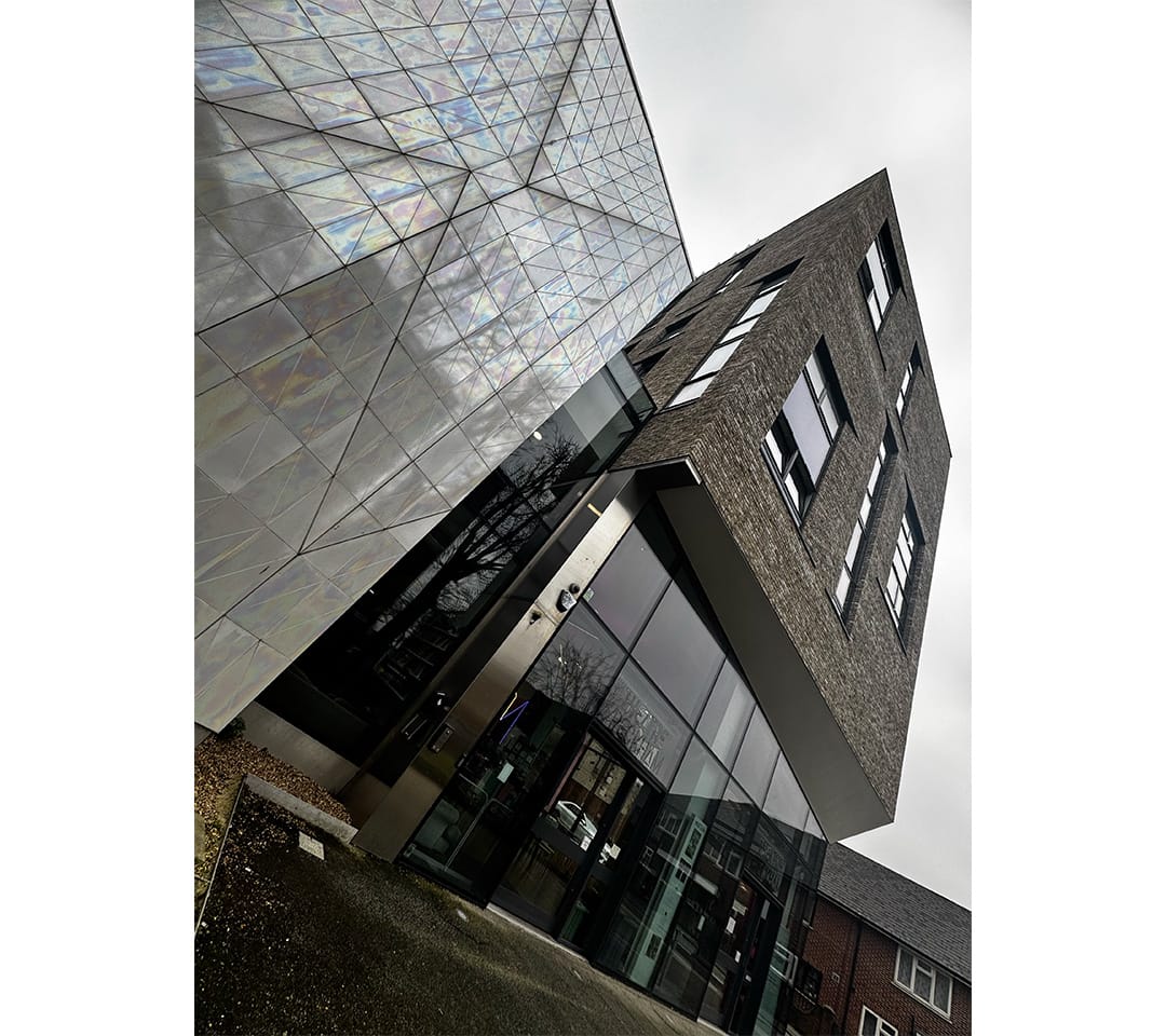
My typeface is Harmony, as a typeface, would embody balance, elegance, and seamless cohesion between letterforms. It would feature smooth, flowing curves combined with structured geometry to create a sense of visual rhythm and unity. The letter spacing would be carefully adjusted to ensure evenness, allowing text to feel fluid and connected. My type-fonts has a no harsh edges everything would feel smooth and natural.

