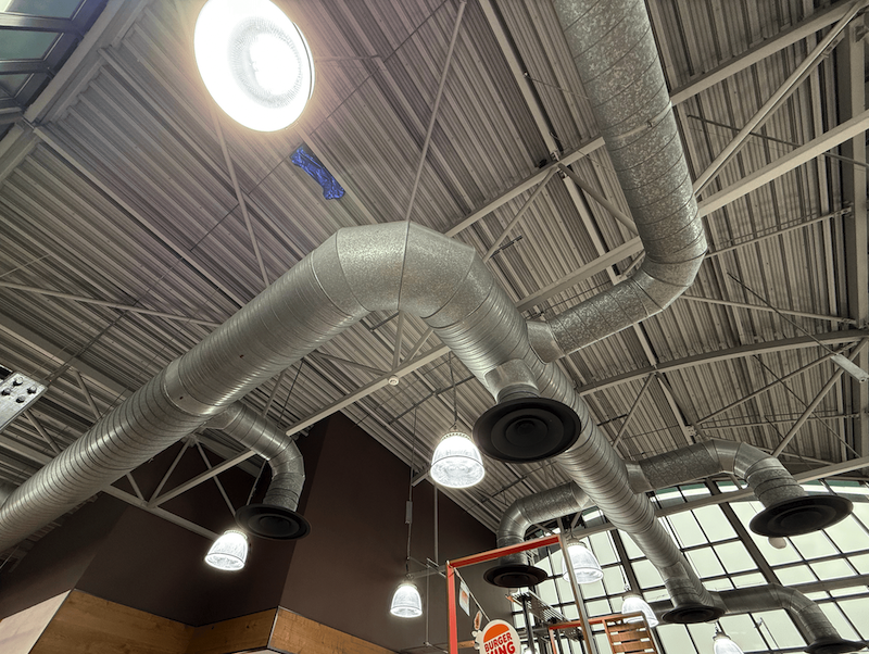
My inspiration comes from Burger King. My font is based on the exterior architectural lines of Burger King and the fonts used by Burger King throughout its history. Each generation of Burger King's fonts has a distinct contrast in thickness. On this basis, I made some changes. I wanted it to look more futuristic and industrial, so I removed the arcs in the font. The final font presented is geometric in style and close to a 3D effect visible to the naked eye, with obvious variations in thickness. These obvious variations in thickness are what I wanted to present as the shadow and also an heritage from the past generation of Burger Kings font

