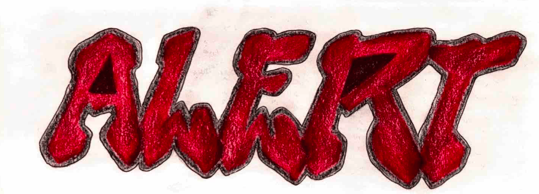
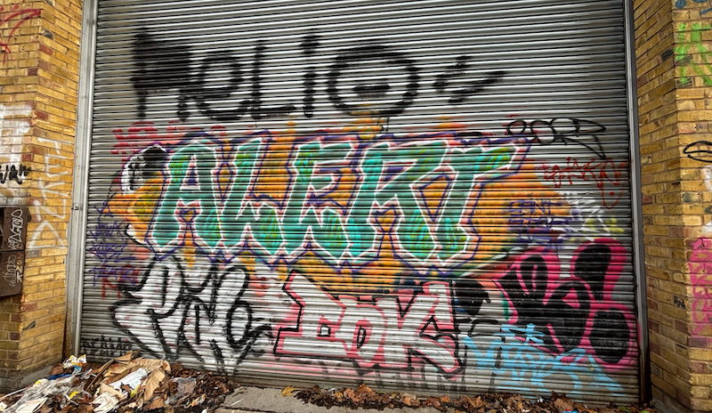
Cutting Edge is a typeface with angular lines and pointed edges, giving it a sense of precision and power. This font is inspired by the lines of a shutter from the location I selected for my case study. The strokes are bold and commanding with no unnecessary decoration or curves, emphasizing clarity and impact. The letterforms are slightly condensed to create a compact feel, allowing the text to appear denser and more assertive. A contrast between thick and thin lines enhances the visual strength of each letter, making them appear more dynamic and giving each character a forceful presence. I wanted to keep the overall appearance modern, aggressive, and confident, perfect for making a strong, attention-grabbing statement.