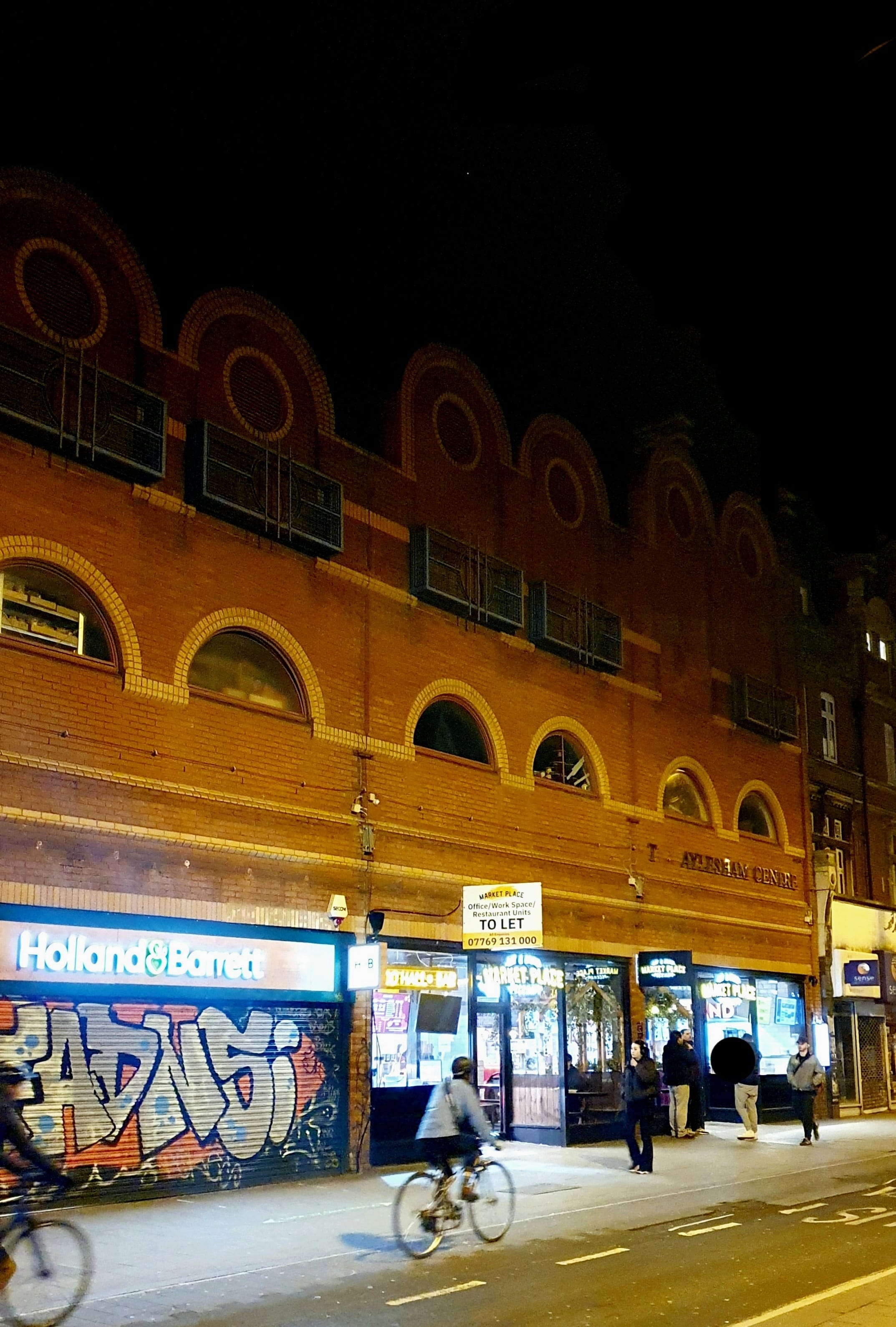
This typeface started as an exploration of the diverse senses tied to the cuisine of Peckham Market ' the rich tastes, smells, sounds, and textures that make the location so unique. But as the design evolved, it naturally became simpler, shifting away from the complexity of the original concept. Instead, highlighting the beauty of blocky, geometric forms of the Aylesham Centre's architecture. Aylesham typeface is intended for bold headers and titles, celebrating strong, straightforward shapes that bring a sense of clarity and structure to the typeface. What began as a sensory exploration transformed into something clean and bold, capturing the solid, lasting presence of the building itself.