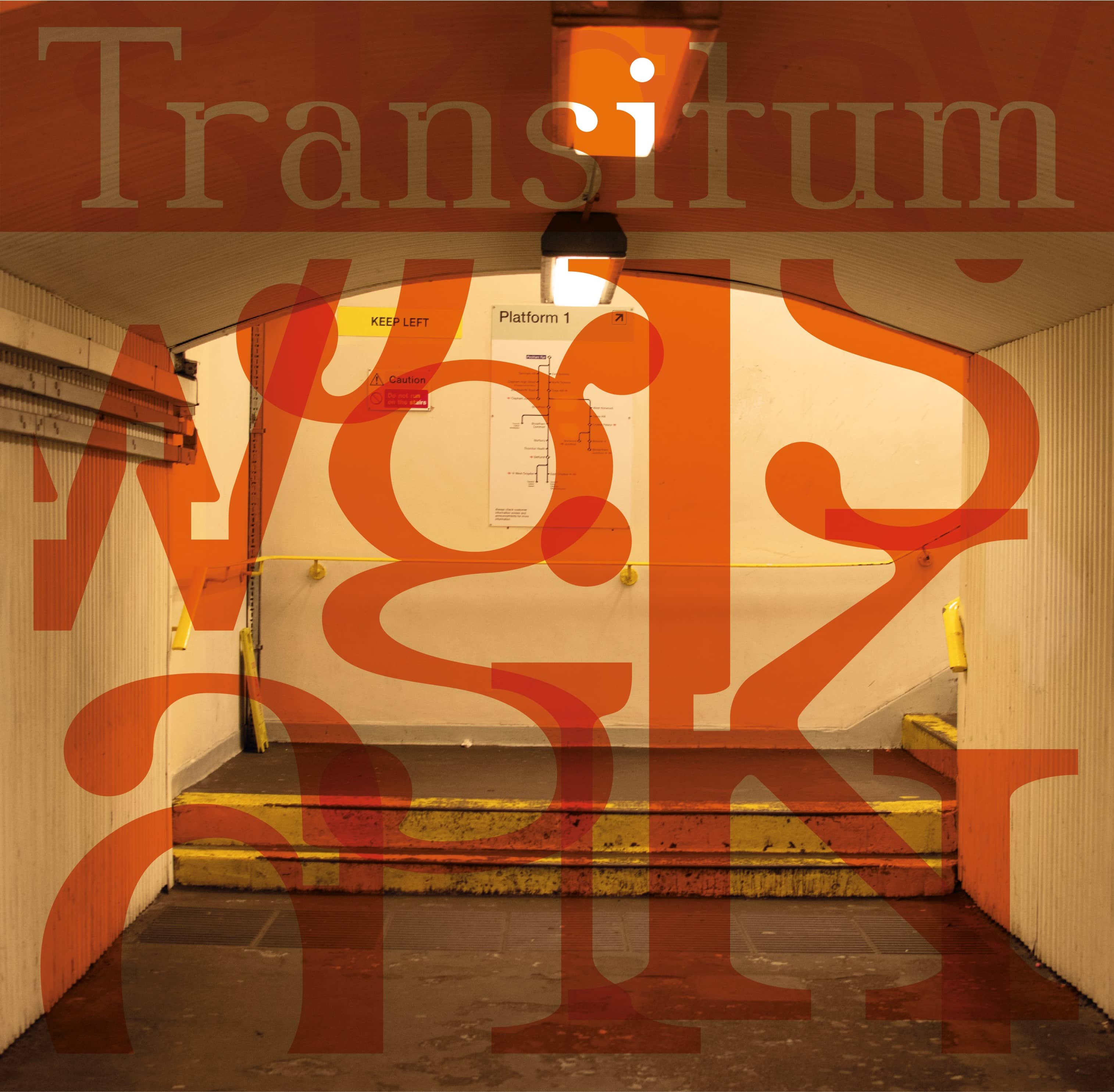
Transitum is a typeface with three styles depicting the loss of human space on the British rail network. The styles reflect a process of optimisation which ultimately culminates in the erasure of any sense of place or structure. Train stations have become negative spaces to be passed through rather than actively utilised, and lack the character they possessed in the past. Likewise, the calculated ink traps in this typeface give rise to an eroded variant which lacks the tangible structure that the inktraps are intended to create.
