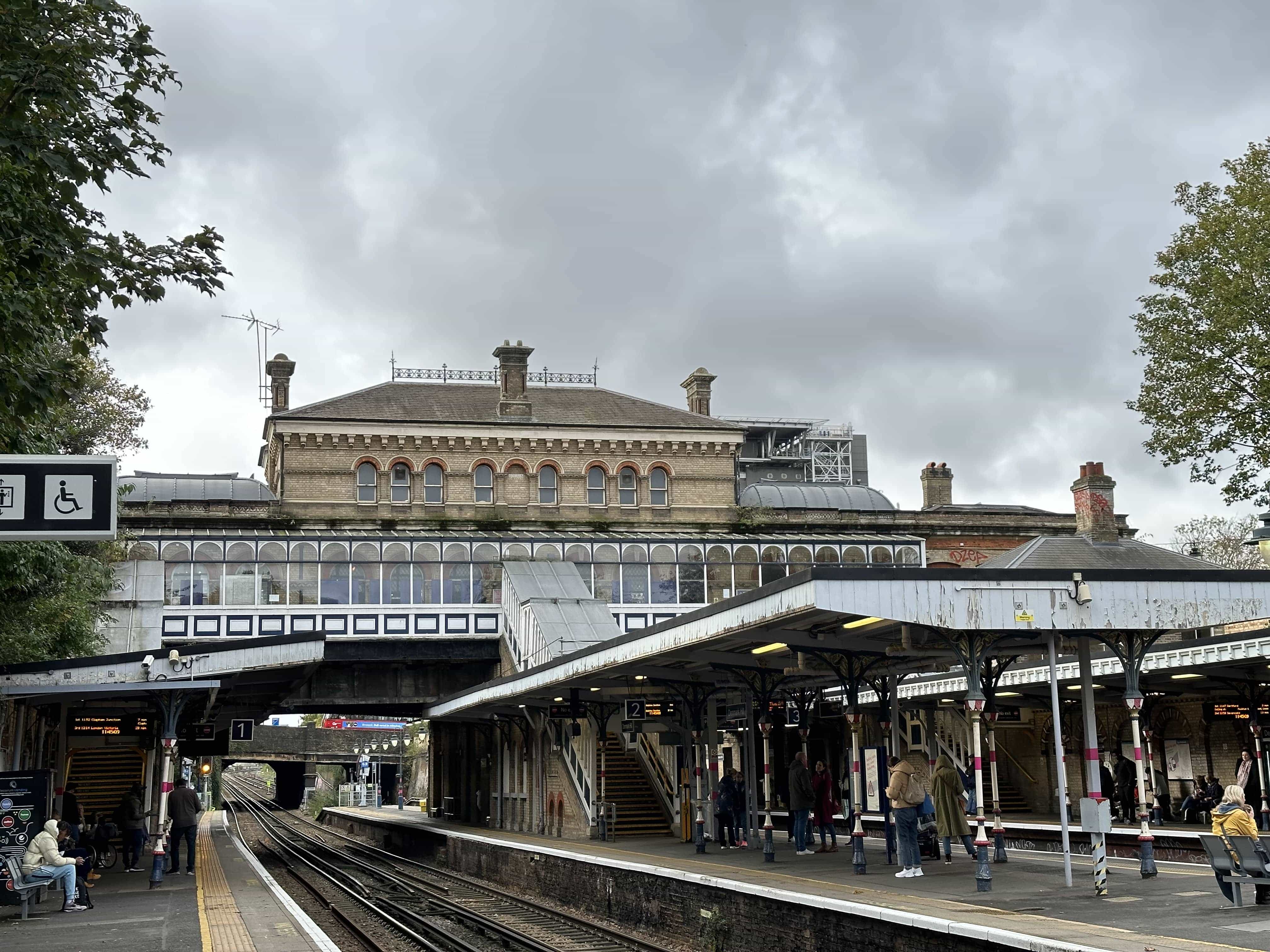
I ended up choosing the third typeface I created, which is thin and has straight lines with curly strokes. It resembles the appearance of ballet dancers’ pointe shoes, so I named it “Pointe”. The inspiration behind the typeface comes from Denmark Hill Station’s long history and Italianate style architecture. All the roofs and bricks have this curly shape, so I wanted to incorporate that into the typeface’s visual language. To accentuate the style of the font, I designed this typeface as a serif. I think this typeface would be a good choice to be used as a headline typeface.