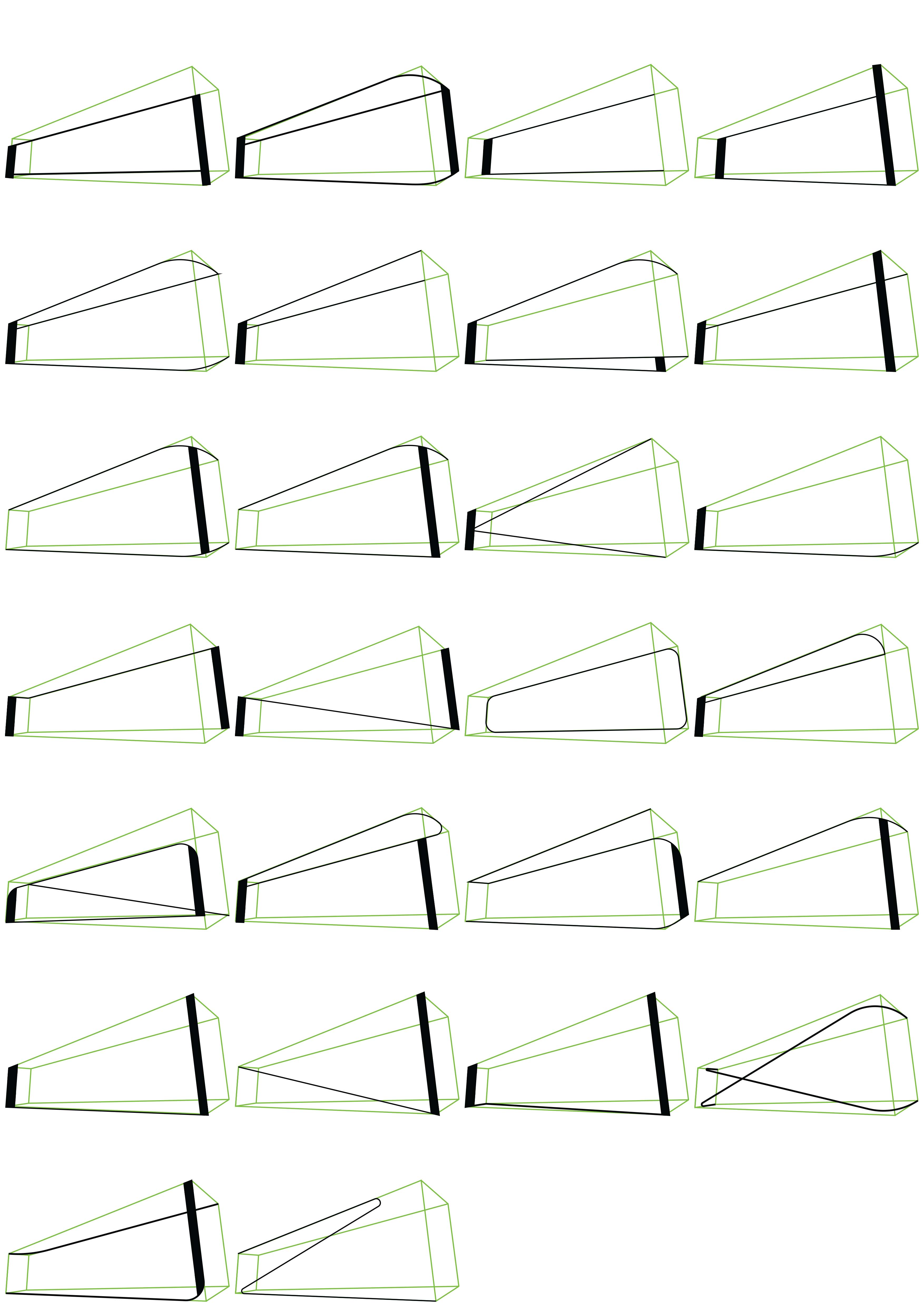
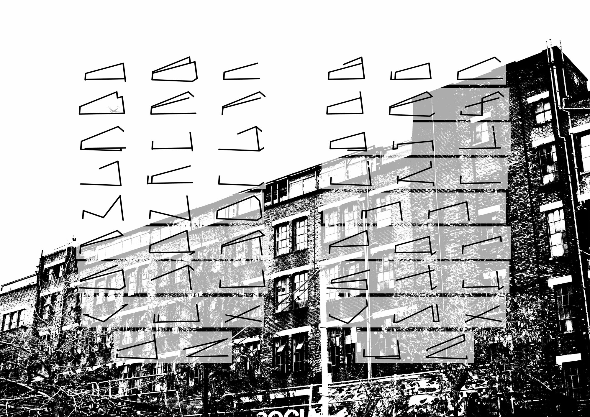
The Bussey Building has historical traces in its architecture. My font takes these traces by tracing the building and using it as its grid and frame. My font can then take the physical shape of the building and emanate these historical traces.
The isometric view of my grid has meant that my type is abstract in nature and sometimes hard to read. To use my typeface, I will apply it to a more logo-based type design. This is because in a localised form my typography may stand a better chance of being understood.