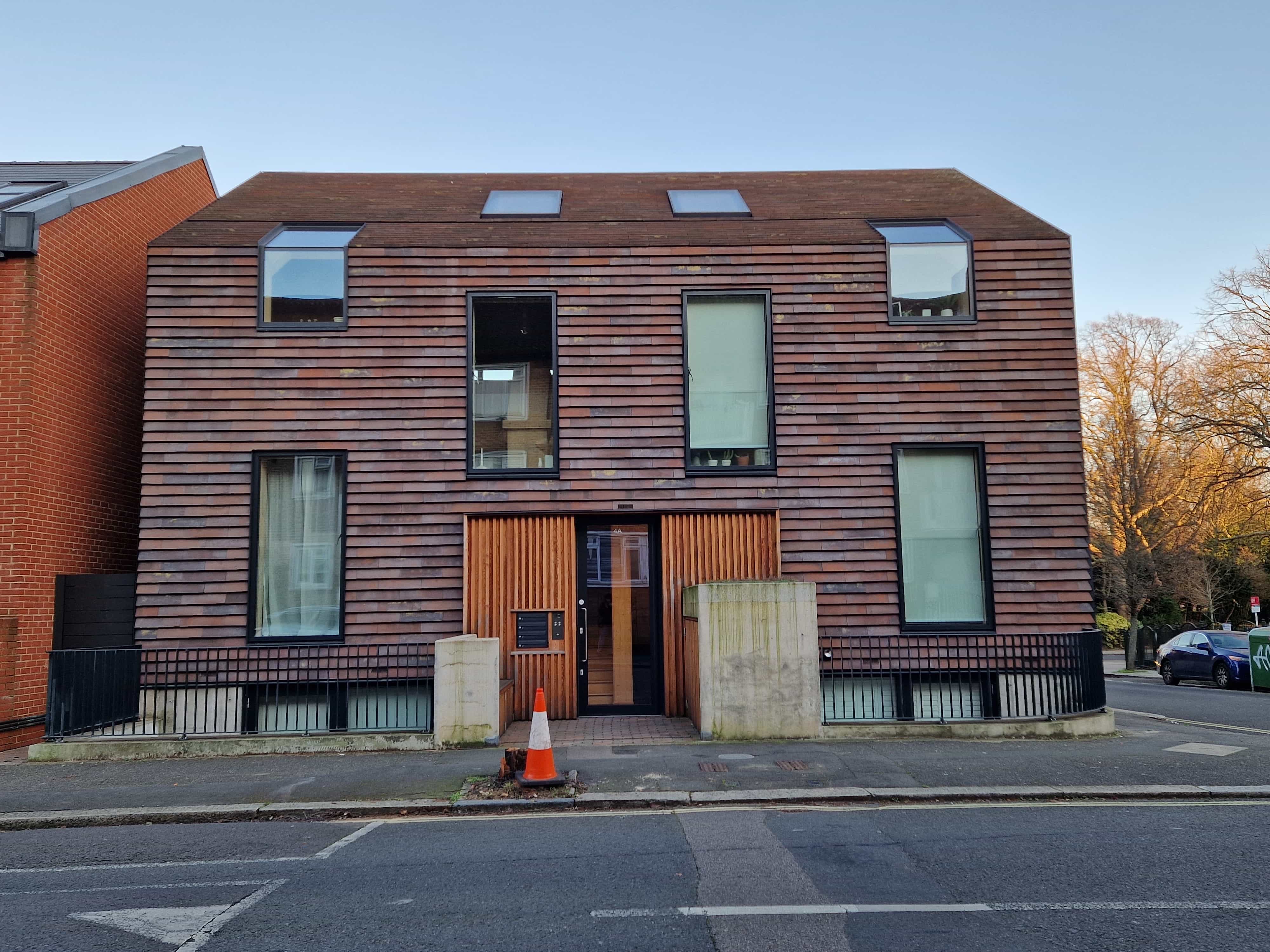
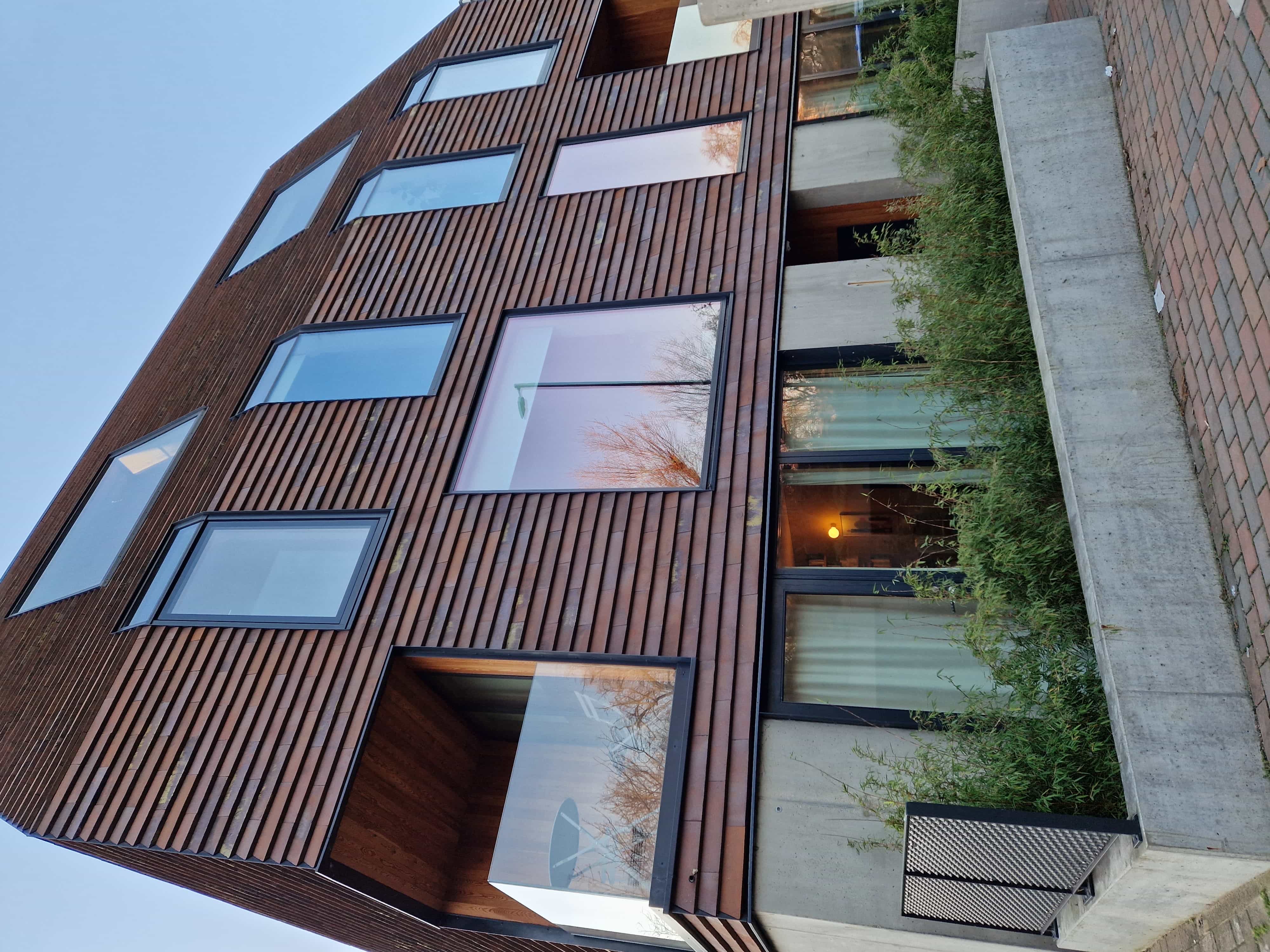
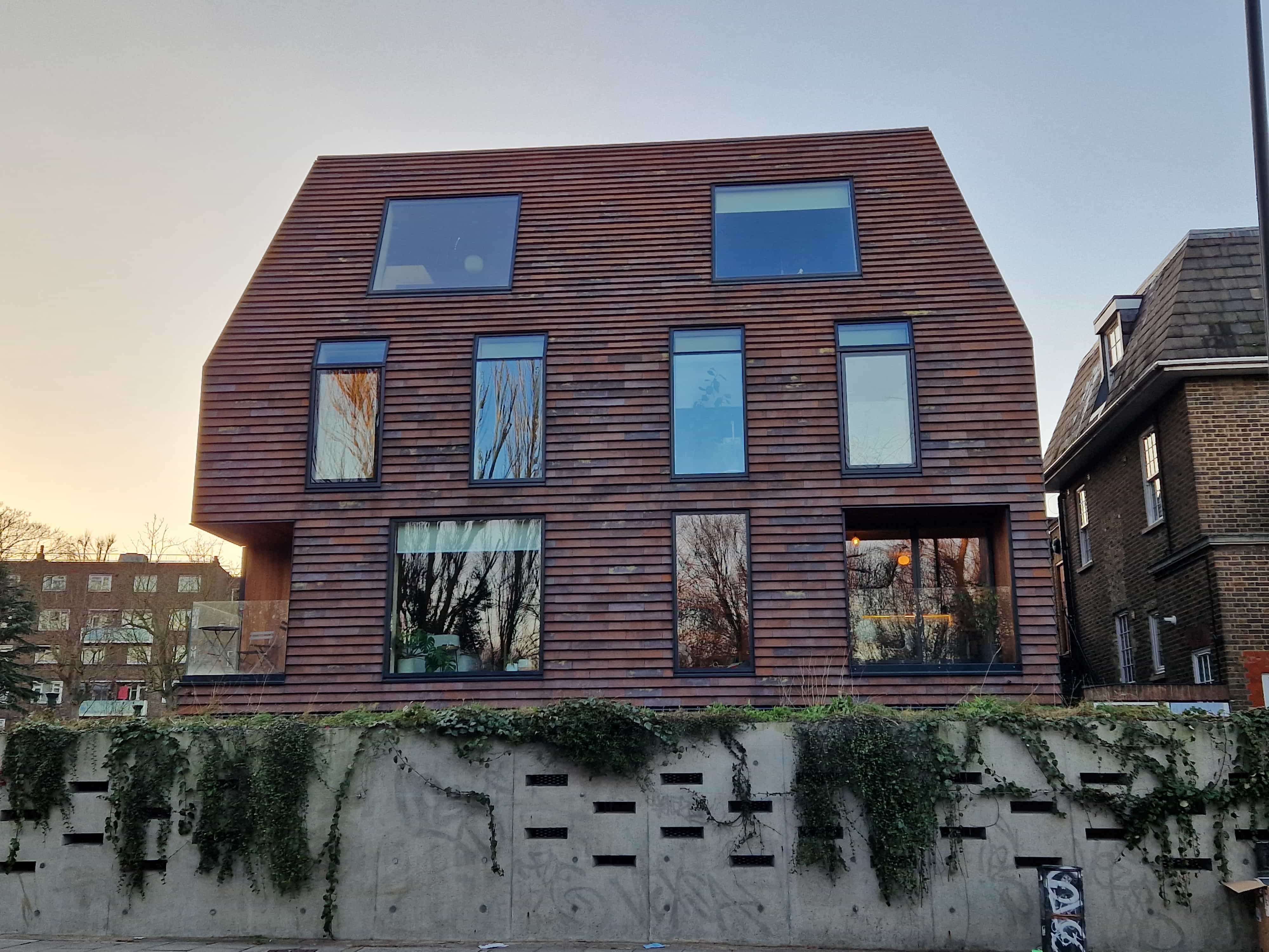
Focusing on the structural foundation of the Peckham rye apartments and the distinct architectural designing of the site my typeface embodies the focus of geometrical shapes to create its body. The simplicity and systemic appearance of triangles became the foundation to my typeface creating a unified and cooperative font with sharp visual lines.
Geoglyphics’ sharp lines and distinct shapes were made to connote a sense of order and reminisce about the particular architecture of the Peckham Rye apartments that connoted a sense of order and simplicity thus hoping to convey a contemporary and minimalist aesthetic when used.