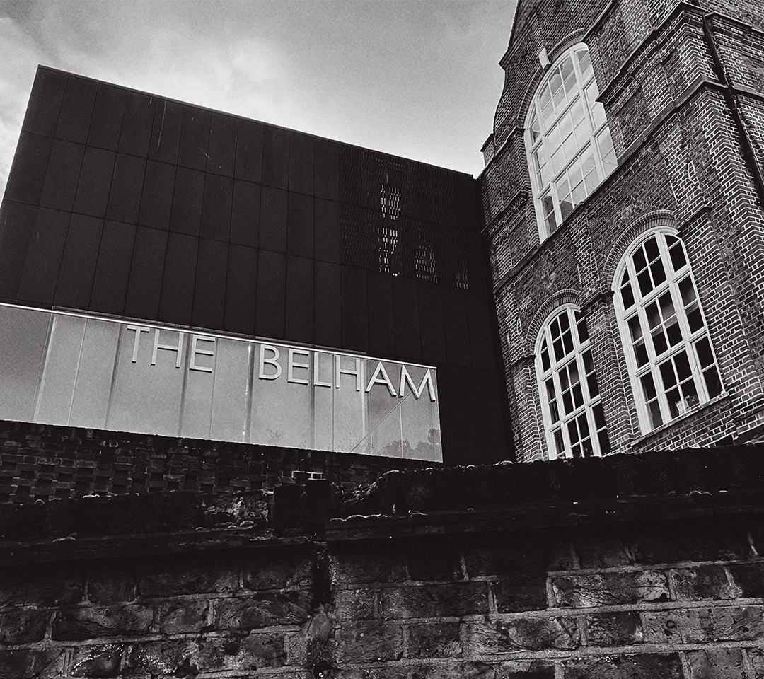
Inspired by the Belham primary school’s unique role of being a combination of both modern and historical architecture, I was set out to replicate its concept of two different parts joined together, which is why most of my letters can be seen as two or more components supporting each other. I was also inspired by what the original Victorian building and the modern extension both had in common, using bricks as their main material in their construction. This lead me to design my font to resemble bricks laid together, which happens to be perfectly in harmony with my core idea of two parts combining. The name “Belick” is a combination of the school’s name: Belham, and the word Brick.