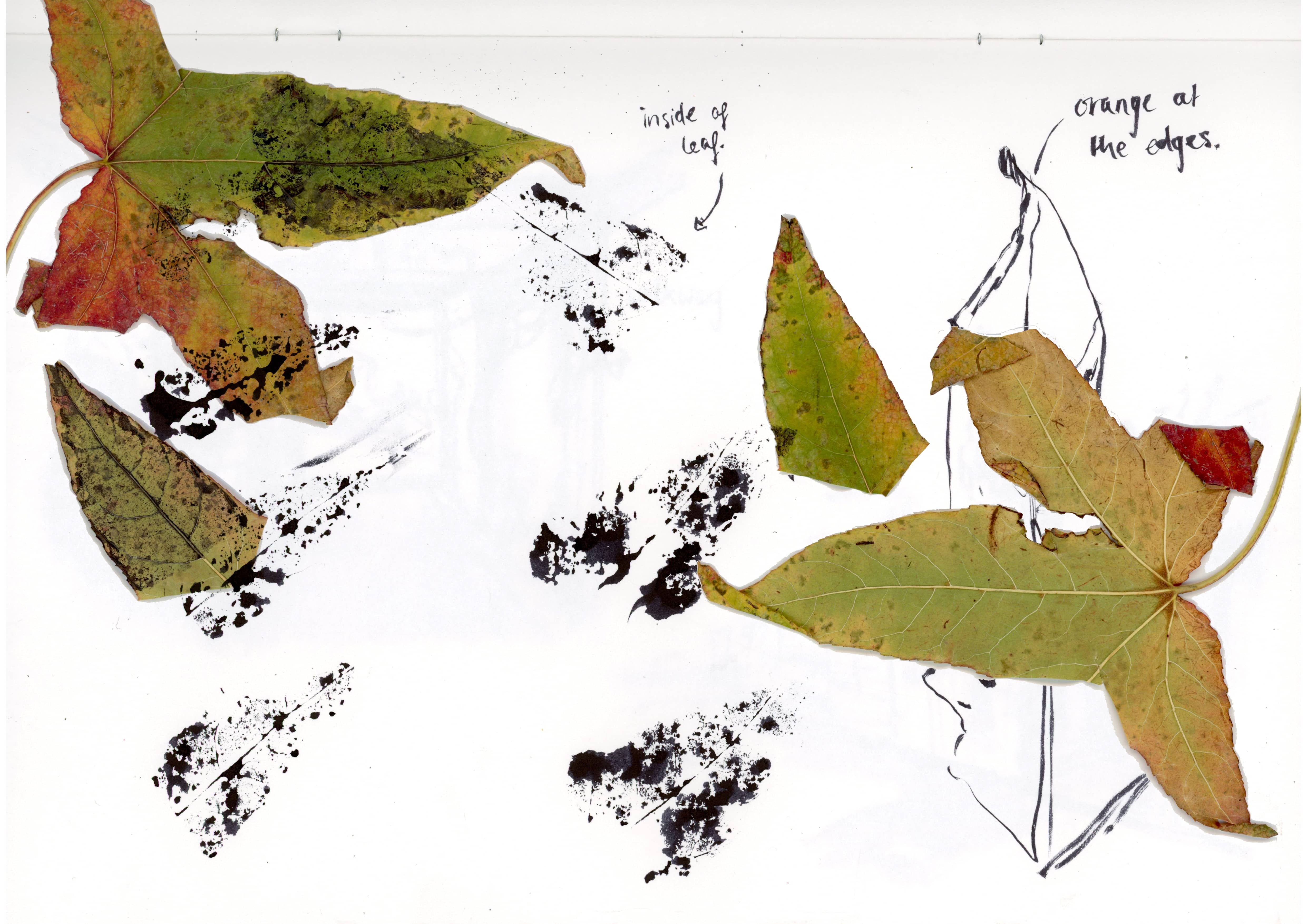
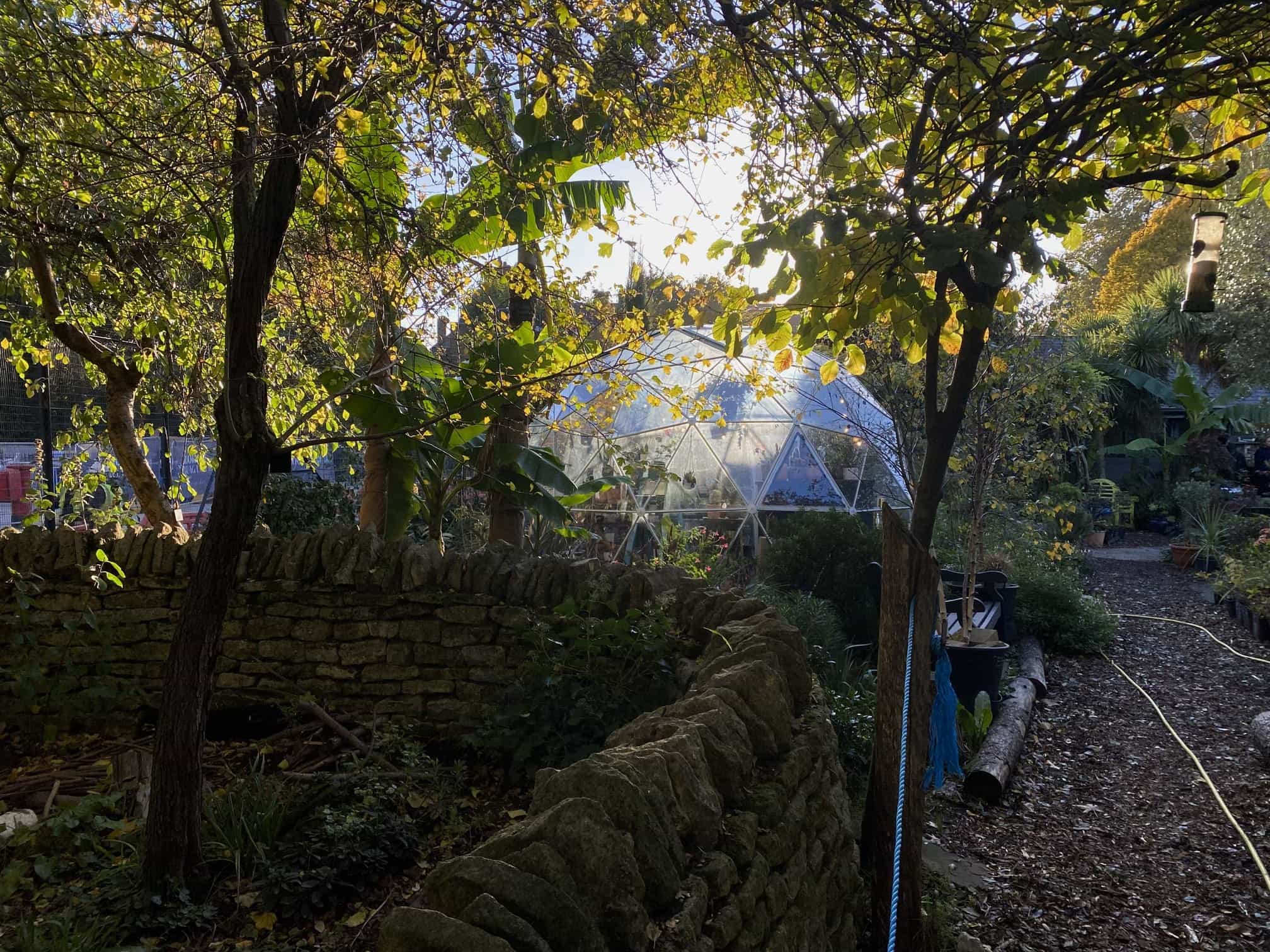
Atramentum was a typeface created with the intention of highlighting the tranquility of the atmosphere at Walworth Garden. To achieve this, I used the natural shapes which are found on the leaves which had fallen on the ground in the garden. By printing leaves from the garden in ink, I uncovered organic shapes and curves which mimic traditional ink calligraphy. I then used these shapes to construct my type design, using modular parts from the ink prints. Using these shapes to create my type design brought about natural serifs which capture the sophisticated and organic aspects of a traditional English garden.