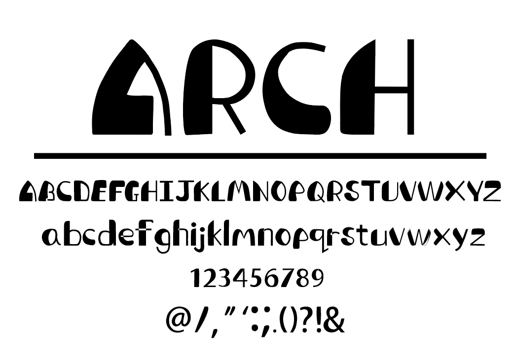
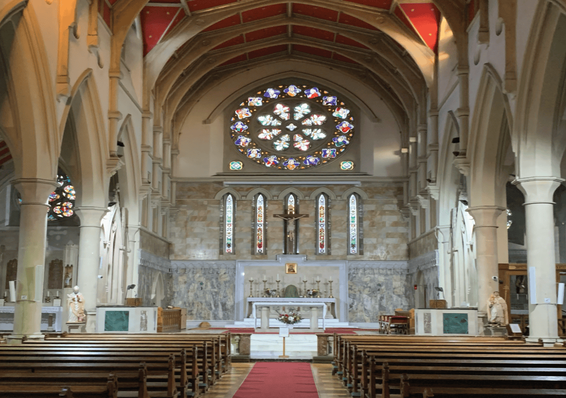
My font was inspired by Our Lady of Sorrow, Peckam. I chose this building because of its gothic architecture. The primary focus was on the ceiling arches that serve as the structural support. The primary feature of the typeface framework is that it consists of oval forms with a variety of thick and thin lines. Each letter is greatly exaggerated, purposely giving them an uneven weight. My typeface aims to represent the Roman Catholic community, as the structure of the arch keeps the whole architecture together, which provides a place for members to gather and be able to embrace their faith in a safe area.