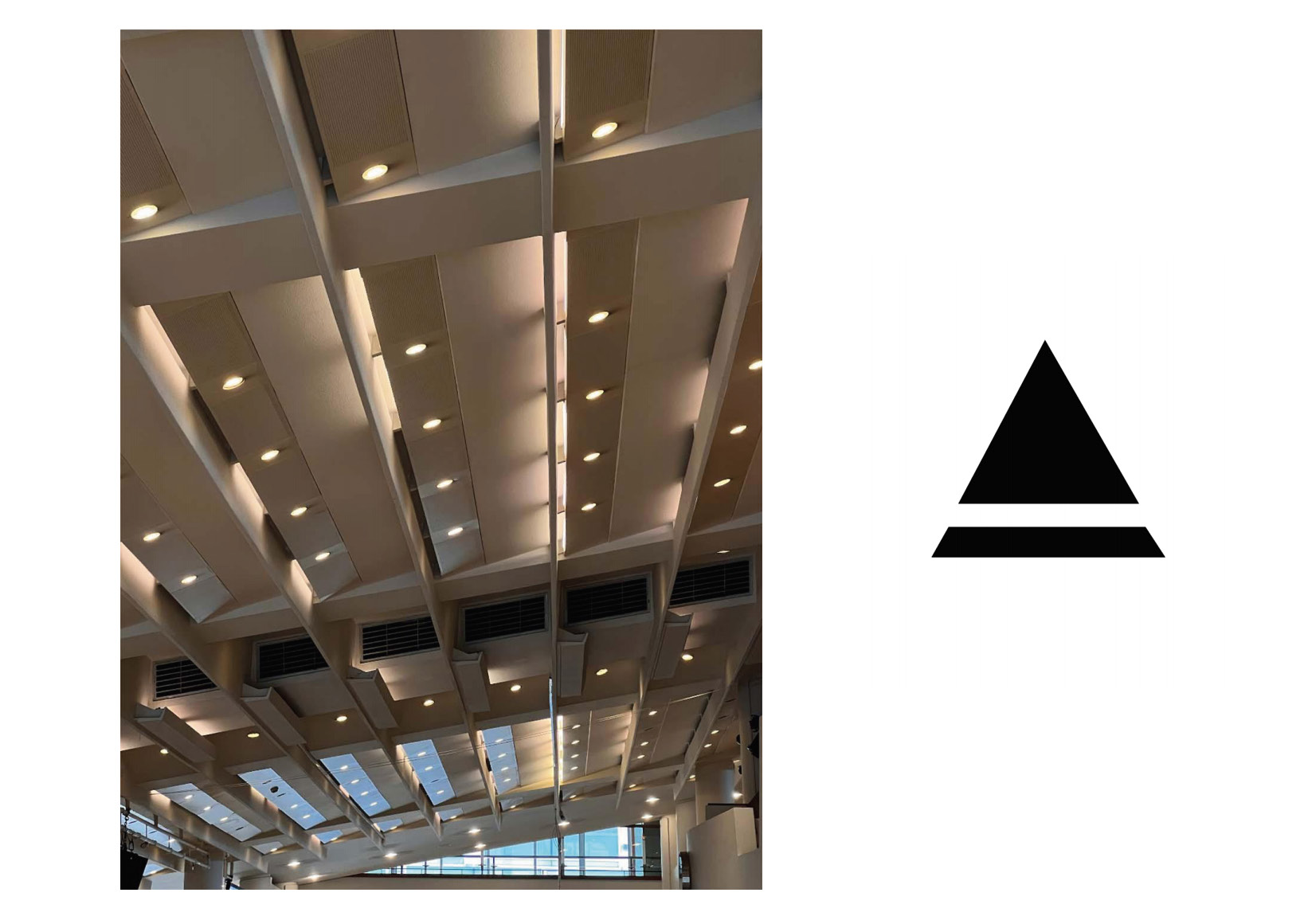
My font design is centered around the architecture I have chosen, combining the architecture with the surrounding design to fonts design, taking the characteristic graphics in the architecture as the center and diverging to the shape design of the letters. I've picked a few examples to make it clearer. The laminated ceiling in the first image echoes the tower structure of the letter A and I simplified it. Similarly, the main object in the second picture is a staircase, with two steps in different directions overlapping each other, which is reminiscent of the letter T. The last picture was taken at the souvenir shop in the Royal Festival Hall. As one of the souvenirs of these mugs, the handle on the mug echoes the round mouth of the mug. Meanwhile, the shadow formed by the light from the side of the mug allows me to distinguish the visual structure of the mug more clearly, so as to generate inspiration and finally form the letter Q.