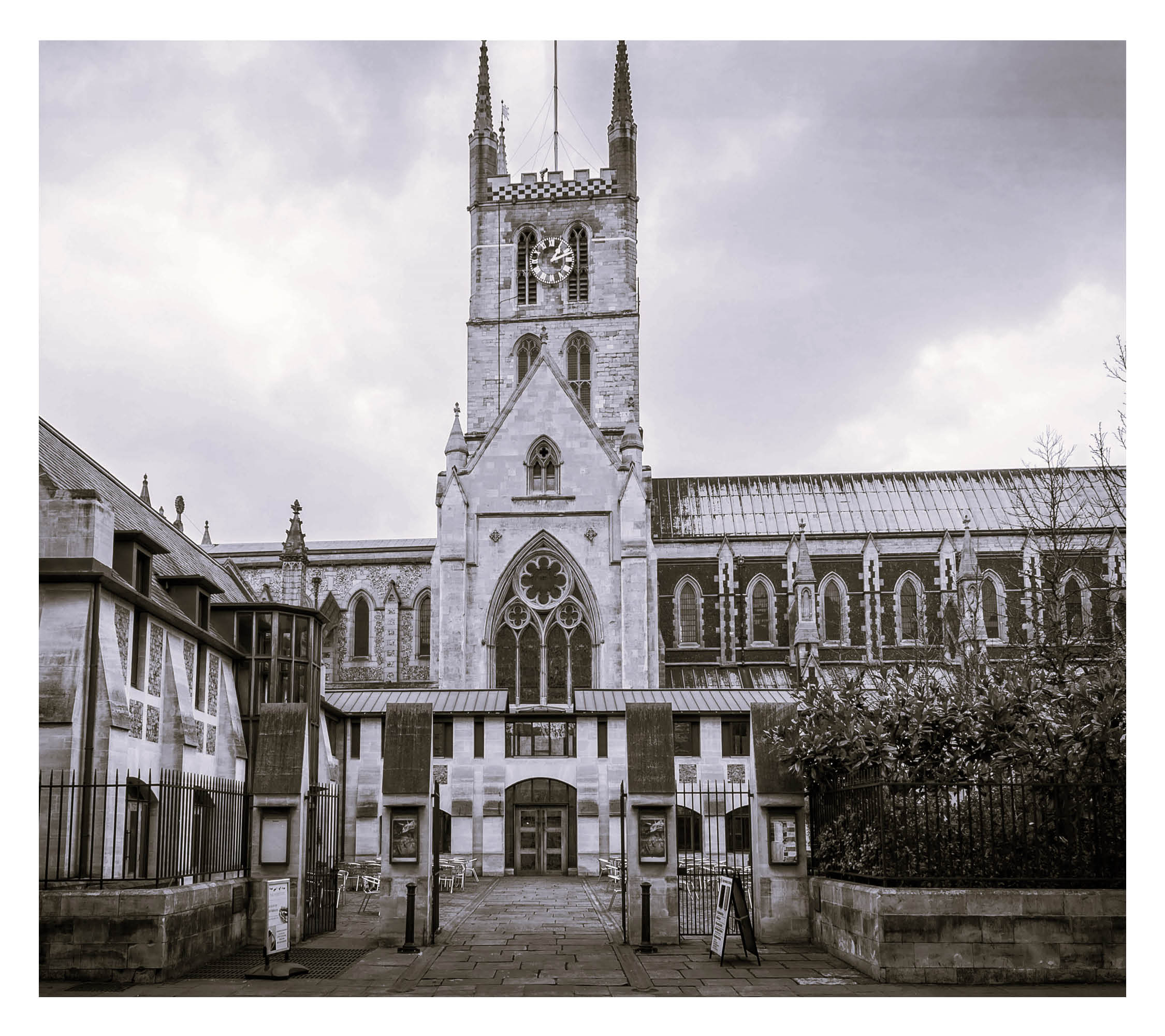
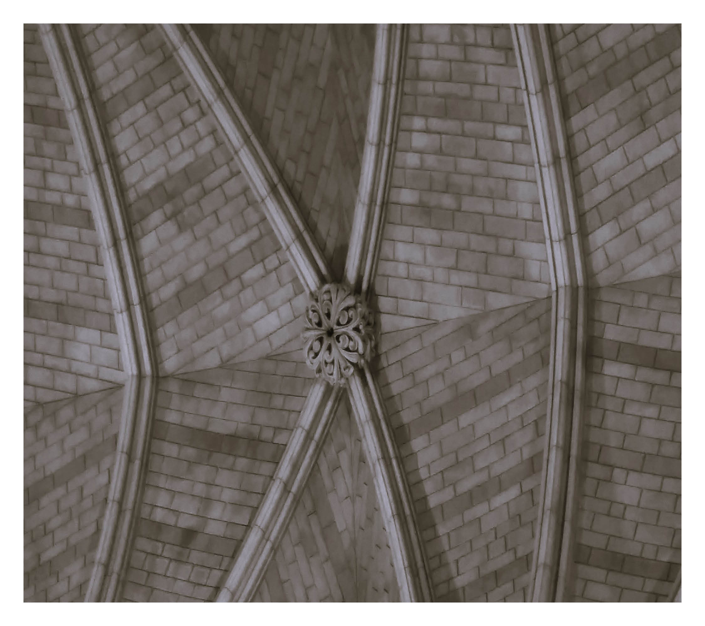
The idea behind the design of this typeface was to use the curves from the arches, that creates the foundation of the building in Southwark Cathedral, as the main feature/shape of the type. I took direct inspiration from the architecture of the building itself and directly referenced it to create the concept of a sharp, rigid and cold typeface. I named it ‘Southwark 800’, taking inspiration from the name of the medieval monument and the 800-year age of it, giving further context behind the rigidness and purposeful slight lack of cleanliness flourished into the typeface.