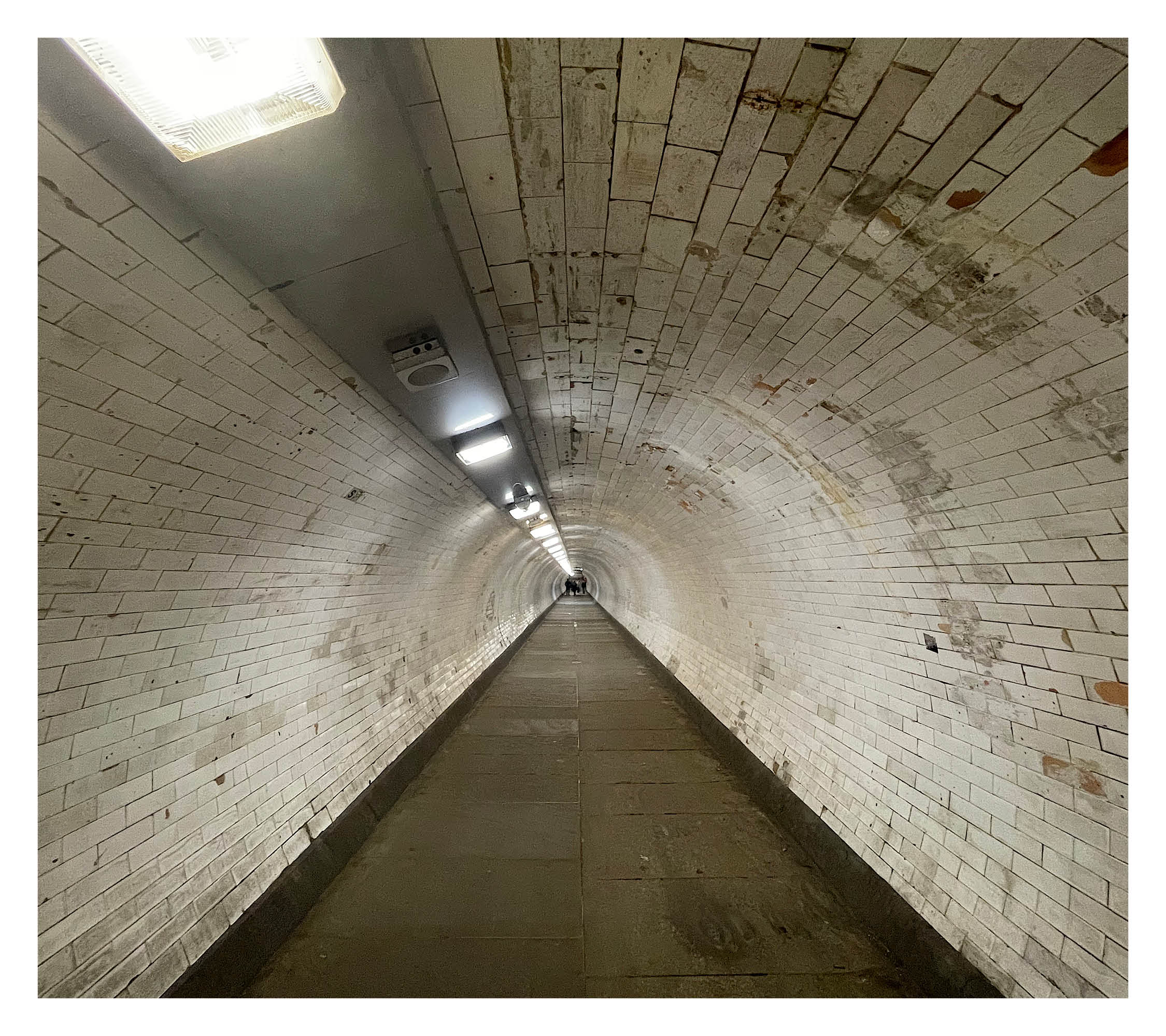
Rather than focussing on visual aspects of the Greenwich Foot Tunnel, Echo Sans draws inspiration from other senses – in particular, sound. The length of time each letter takes to travel through the acoustics of the tunnel creates the variable width that is seen in each letter. The longer each sound takes, the wider the character is. The name references the term ‘echo’, alluding to the audible effects.