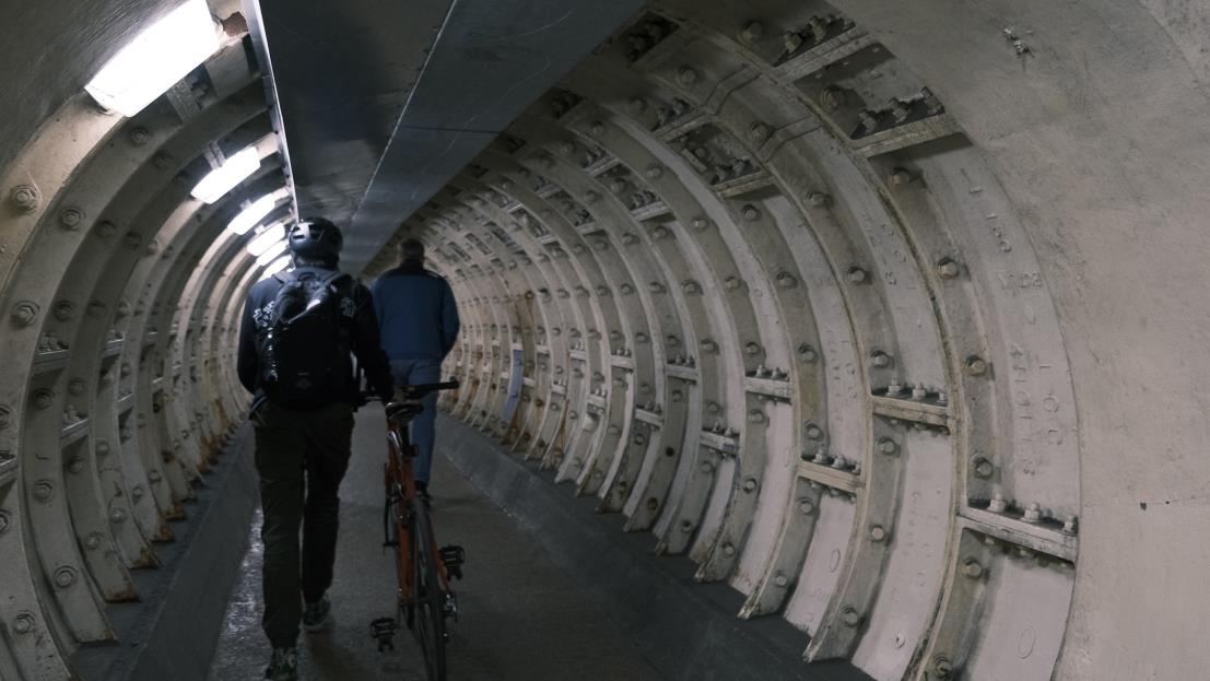
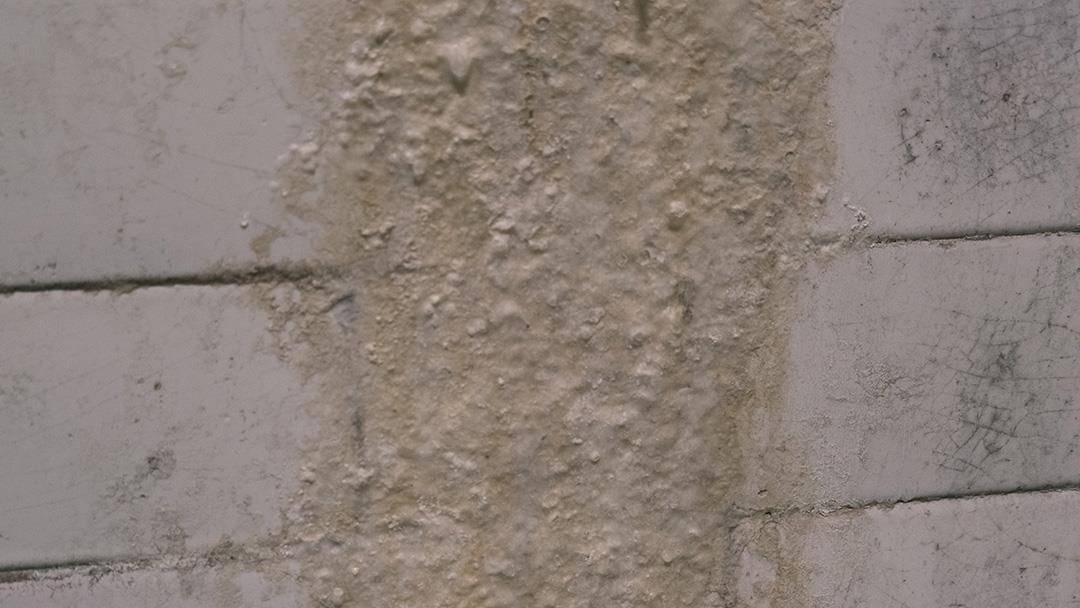
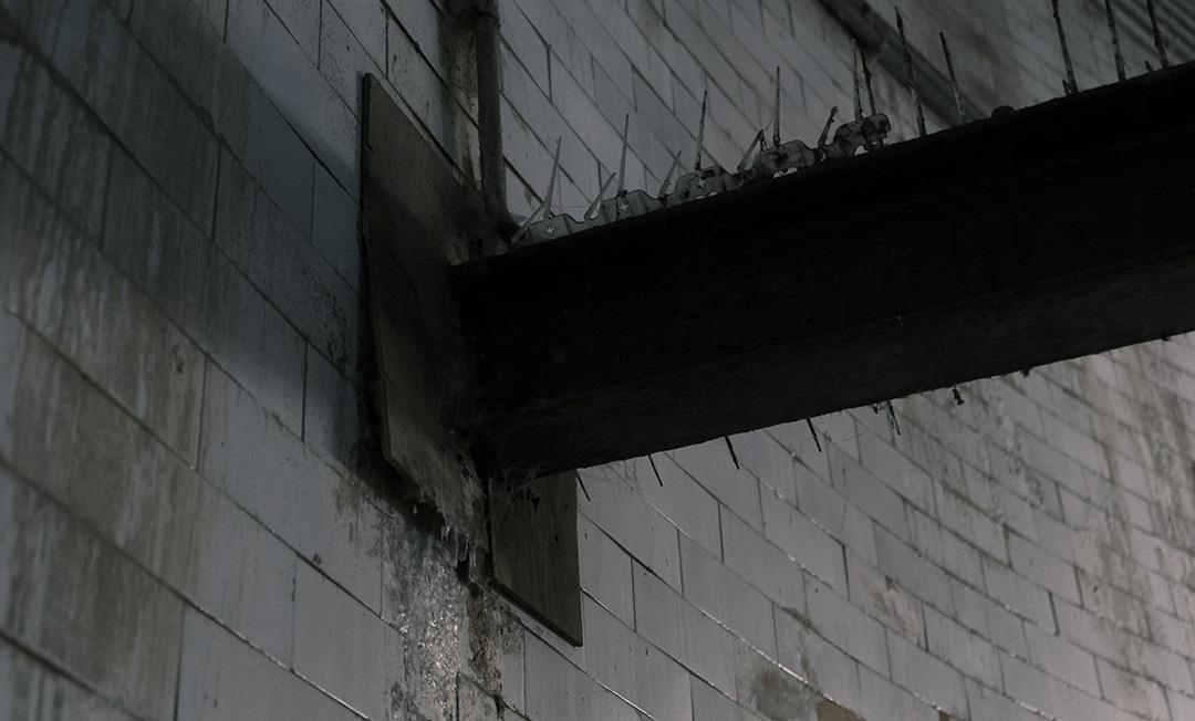
When I was in the Greenwich Foot Tunnel, the cylindrical architectural design created a sense of time standing still. I stand here feeling that the space accentuates the sound of bicycles rolling, the footsteps of pedestrians and the echoes caused by people's conversation as if I were experiencing a time machine. And the walls, which the river had wetted over time, had left thick traces. These images and research experiences led me to design this typeface, with the font type (rounded) from the shape of the tunnel, the style (serif) from the history of the tunnel, and the font detail (water droplets) from the Thames on the tunnel and water damage on the wall.