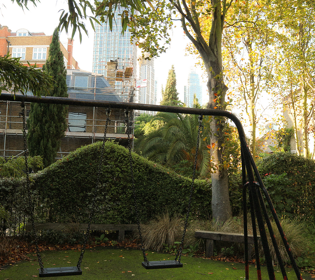
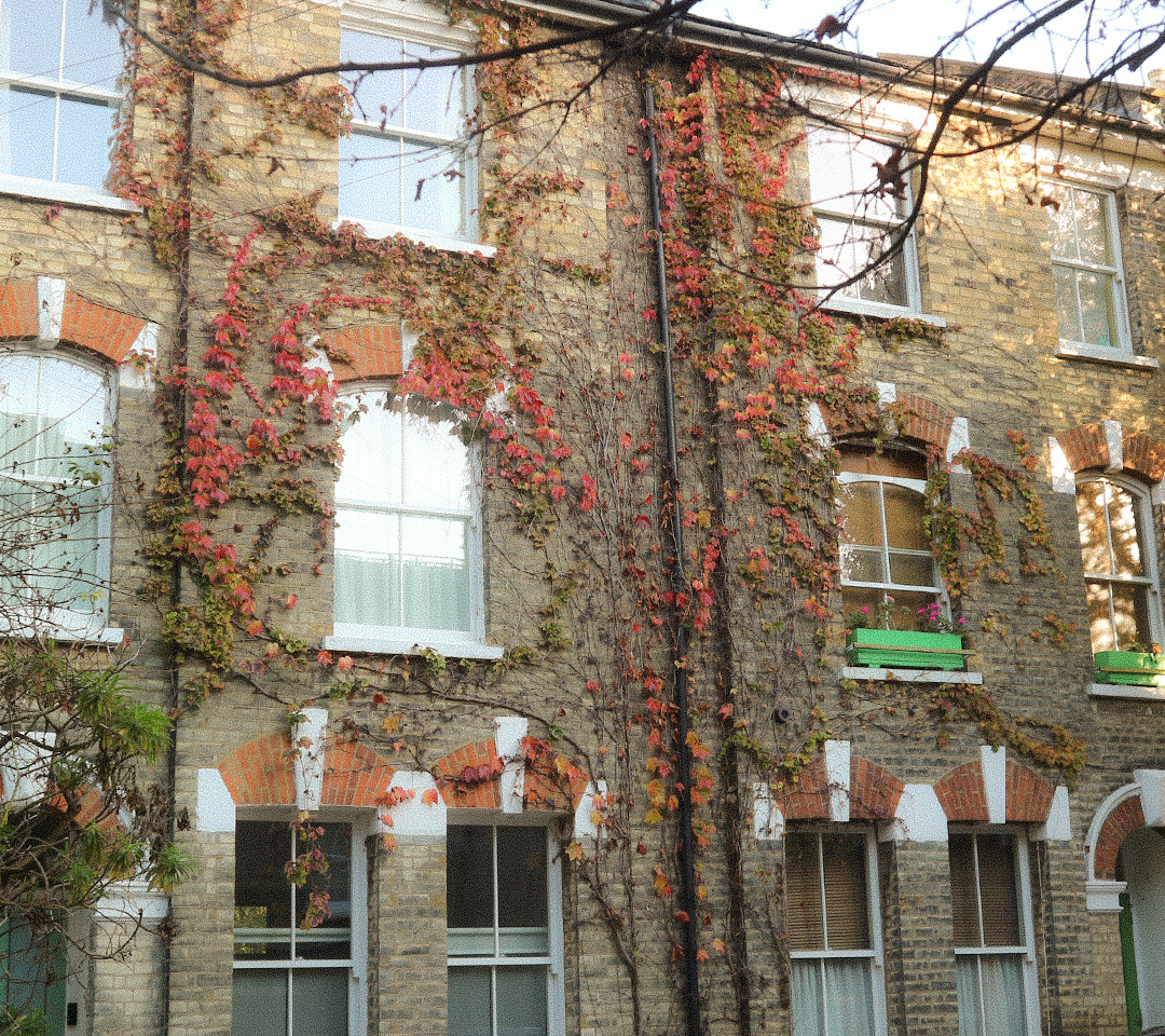
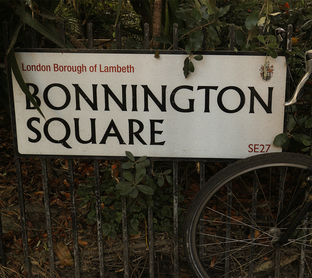
Contra Bold is a type inspired by Bonnington square and focuses on the key details of the arches often found in the neighbourhood area where you would see them above resident houses. I decided to combine this element of ‘inner city living’ and the recurring imagery of skyscraper windows you would see around London through the use of straight geometric lines to represent these windows. When combined together, you get a contrast of how different life in Bonnington square can be different to the rest of the city. Contra bold i would say is heavy weighted and thick and has the essence of modular type.