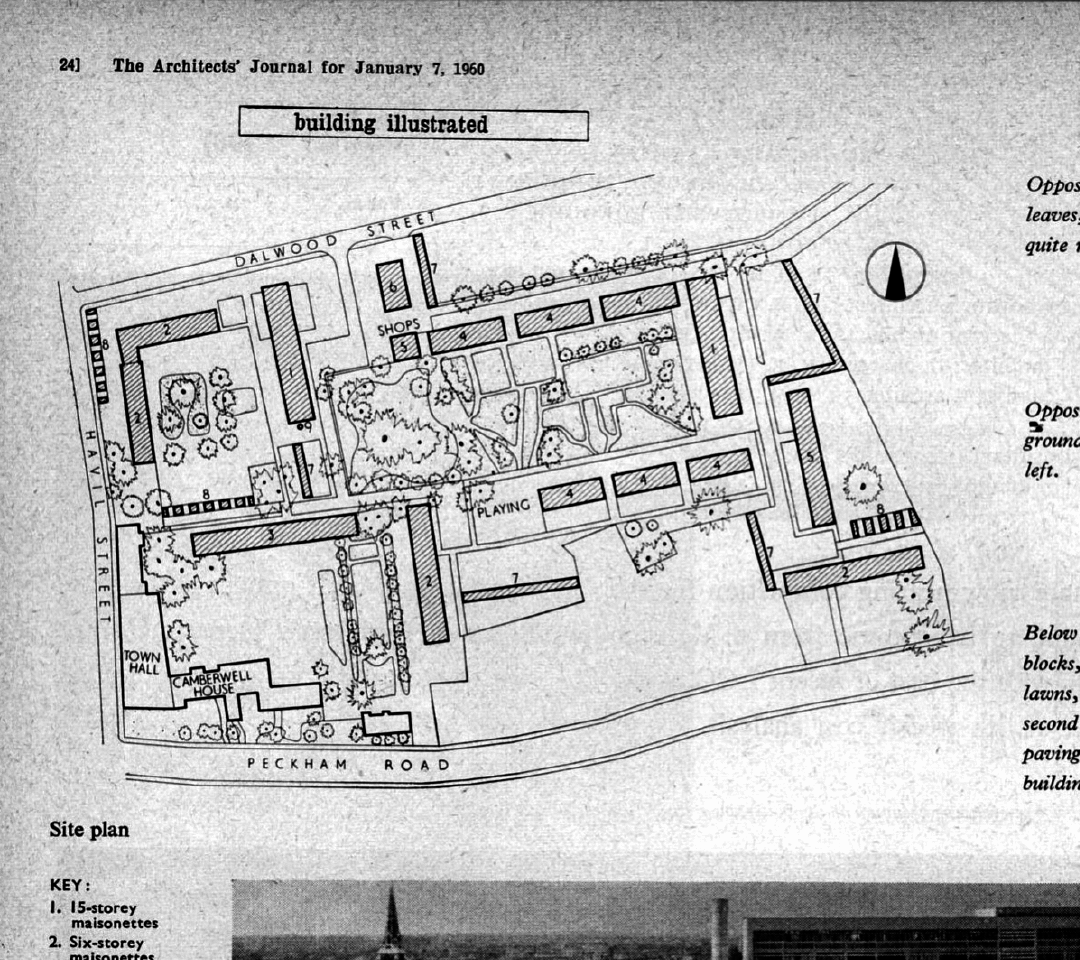
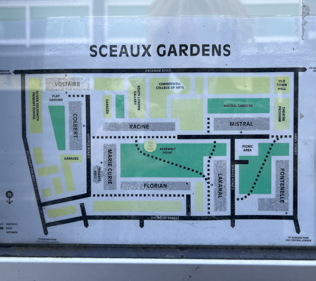
Architeaux is a regular font, with expanded lettering portraying the shape of the Sceaux Gardens estate. The font is greatly inspired by the architect's journal for the building, created in 1960. I've incorporated shapes from the building sketches into my letters, creating a modern, sans-serif font. The font has curvaceous styling, and to create the expanded look, the caps height and x-height of the letters are much lower than normal. The "sketch lines" effect is prominent throughout the font, giving it a unique look.