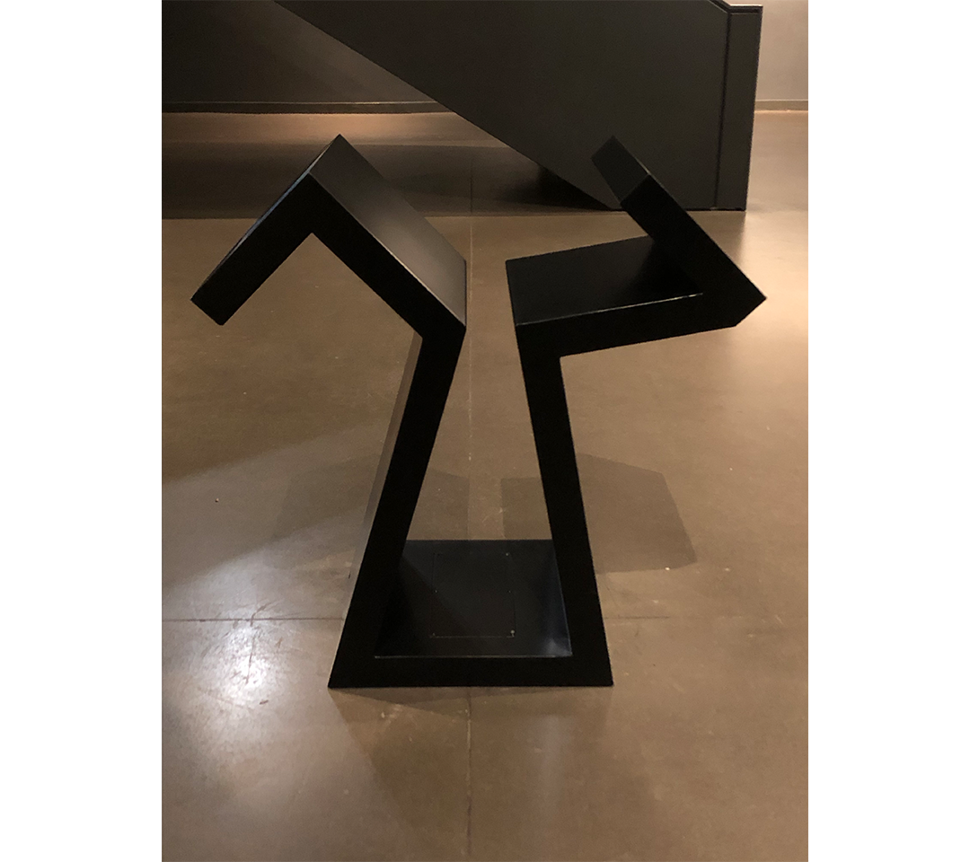
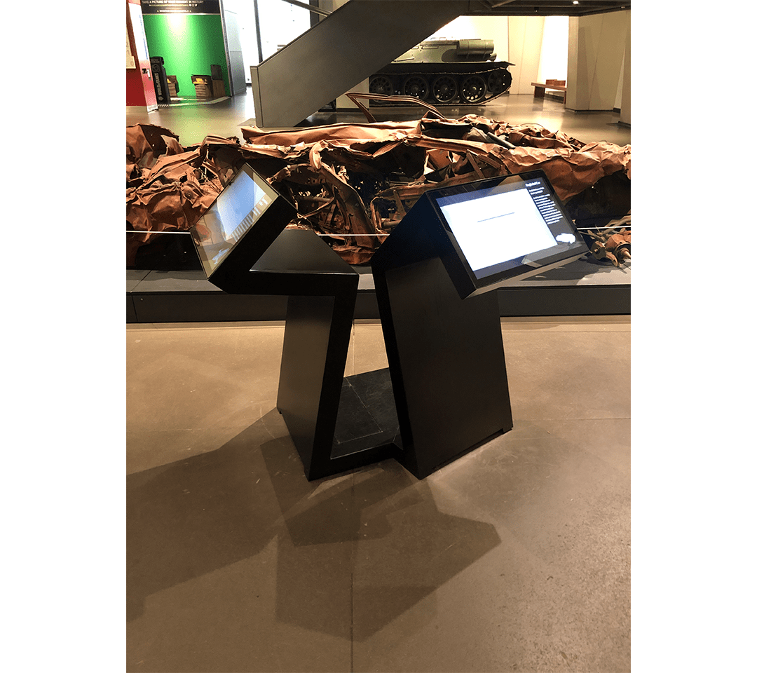
When I visited the Imperial War Museum, the interior was full of oddly shaped information stands next to most of the exhibits. I liked the unconventional angled design of them and thought it would be a good idea to imitate their appearance in my typeface. The aim of my font was that each individual letter could theoretically be used as a real object to fulfil the purpose of displaying information. The individual characters follow similar rules of their real life counterparts with a flat stand at the bottom, and sloping features at the top where the visual information would be displayed